View attachment 5623454
You must be registered to see the links
Hello to all of you
Black Incense fans out there. It’s Tuesday, and so as always, that means it’s time for another dev diary…
In
You must be registered to see the links
I had said I would spend this one talking about my approach to writing and planning out the story across episode, season, and whole-game arcs. However, that is a
considerable topic which I want to do proper justice to when I have the time to dive into it, and this week, I’m really focused on blitzing the prologue revamp for release this weekend. I will get around to this topic in a future diary, but I think that is one best tackled when I have a relatively quiet week.
So instead, this week I thought I’d focus on something a bit more light touch (but hopefully still of interest), which has been very much at the front of my mind this past week as I focus on the images for both the prologue revamp and Season 1 Episode 2 (due out end of January) - colour theory in game…
Colour Theory in Black Incense
I think most people instinctively ‘get’ colour theory, even if they have never heard of the term before. There are many definitions out there depending both on the context and the person giving the definition, but to put it loosely, when talking about
Black Incense, colour theory refers to the deliberate use of colour in game to signify character, mood, place, and a whole host of other things.
In this regard, you can think of colour as a language that can be used to communicate certain things to the players of the game. One of the most simple but effective examples of this is just to help players tell different characters apart at a simple glance.
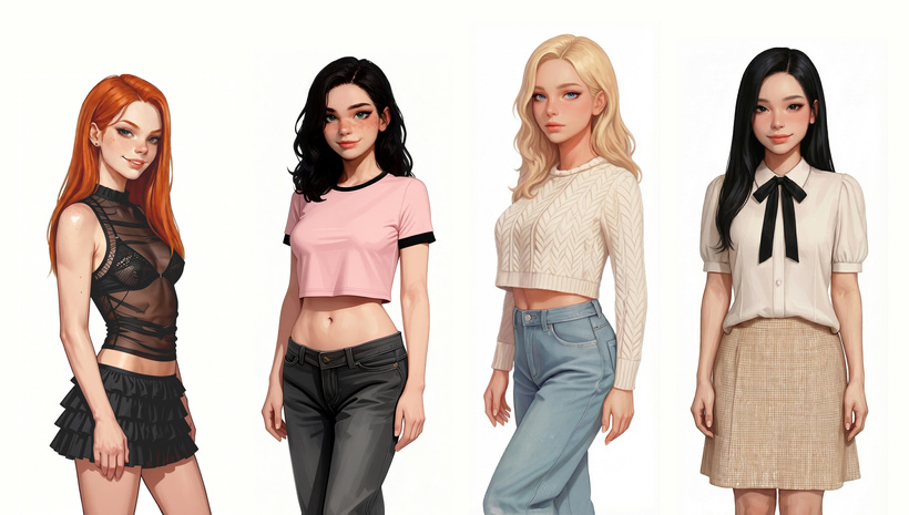
If it works it works
Once you know to look for this, you'll find it everywhere. Our brains are hardwired to focus on and remember differences like these, making it a particularly useful tool for creators to use to help players intuitively recognise characters at a glance. Hence why Molly has a certain unified look across many of her sprites (you can check out the sneak peek of all seventy (!) new Molly sprites for the prologue revamp
You must be registered to see the links
), as demonstrated below:
You can have any colour of Molly you want, as long as she's pink and white and black
Of course, colour can be used for much more than simply telling two characters apart. It can also be used to communicate some aspect of that character’s personality or disposition. Again, I think this is something that we all understand on some level, from an early age. Red is often understood to denote energy, sensuality, and volatility. Blue is calm and cool and collected. Grey is serious and professional. Brown is neutral and restrained. Pastel pink is feminine. White is pure and innocent (hence why bridal dresses are white throughout many places in the world). Black can be evil, or edgy, or secretive, or a number of other things. None of these are hard rules (and different cultures may have entirely different interpretations on this) but they are a useful shorthand for creators to use.
As I was designing the main characters for the game, I therefore wanted to think about the colours I was associating them with, not simply to help you tell them apart at a glance, but to offer some glimpse into their general disposition.
Or more than a glimpse, in the case of Sienna
This can also be used to denote changes to a character within a scene, or across an unfolding storyline. For example, most of Molly’s outfits at the outset of the game contain one or more of pastel pinks, black, and white. As the game progresses, and the opportunities broaden for Molly to act in a range of ways both moral and immoral, it will be fun for me to think about how to tie this into her outfits. Whilst this can become too restrictive if followed dogmatically, generally speaking it would make sense for her immoral paths to have more black elements to her clothes, and her more pure/moral paths to have more white elements to her clothes.
We can then go further with this, implicitly tying certain places or objects to certain characters through the colour that the player begins to subconsciously associate them with. Supporters of the game have already had a
You must be registered to see the links
into the bedrooms of Imogen, Sienna, and Joy, which you will get a chance to see in Season One Episode Two later this month, which were all designed to conform to their individual characters.
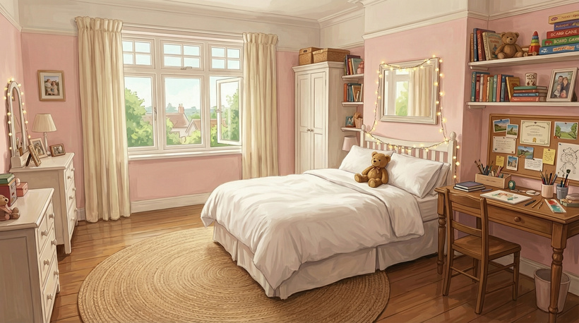
I have also redesigned Molly’s childhood bedroom for the upcoming prologue revamp, and am excited to share it here as an example of linking person to place through the use of colour.
Home sweet home
I also used colour theory when designing the UI of the game. I deliberately restricted myself to black and a range of smoky and dusky reds, pinks, purples, and oranges for
Black Incense’s interface. This not only makes the game experience feel more consistent across various screens, it also immediately communicates to any prospective player that this game will have a dark, sensual, mysterious vibe to it. You can even see that this carries over to the banners I use for the posts here on Patreon!
Just one possible Molly build, yours may vary...
Looking Ahead
This really does only scratch the surface of colour theory in game, but as I said at the beginning, this dev diary is deliberately a bit shorter this week to give me more time on the prologue revamp. There are plenty of other areas and ways colour can be used, but that will have to wait for another time!
The revamp should be out with you later this week, so do keep a look out for when it arrives. And in the meantime, if you watch or play something over the next week, why not challenge yourself to see if you can spot the ways the creator has used colour theory? Once you start to notice it, you’ll find it everywhere.
Next week I think I will delve into another medium for communicating emotion and mood in game - the music of
Black Incense.
As always, have a fantastic week. If you have any questions or comments do leave them below - I always read with interest and reply!
Himeros