
Guy -you should make a short story... looks really very nice... ;-)Man, pretty solid stuff here!
Because of Chap5 and the story around Sai's dick I've been tempted to do a lil' edit on this one...
It's subtle but...
View attachment 4530144
Fan Art My New Girlfriend [CircleGames] - Fan-art
- Thread starter Yougiblack
- Start date
5.00 star(s)
1 Vote
- Jan 14, 2020
- 128
- 241
Not my work go say that to ImmaculateDream !!Guy -you should make a short story... looks really very nice... ;-)
- Mar 2, 2018
- 250
- 588
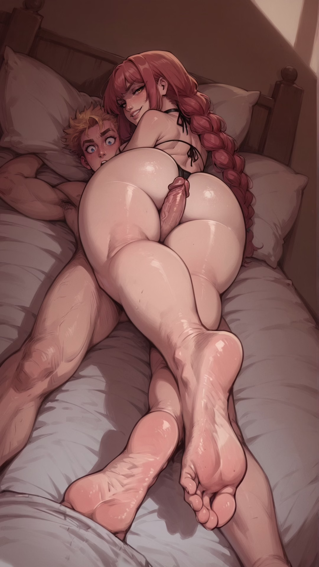
Yeah, I mean, I have different pairings for pretty much all the characters that I really want to see, but I love Eric and Maki conceptually. The beach handjob scene was such a hot escalation at the time; it's just a bit disappointing that it was just a handjob, and that they've so little with them since then. I'm also hoping that once Maki actually does something again, she'll have either Anya or Vi involved somehow (even if it's just watching). We all know she wants other people to watch Erik and her.View attachment 4528335 View attachment 4528336 View attachment 4528343
I find Eric and Maki to have the most interesting dynamic in the entire game, her talking about taking his load in her mouth and him slapping her last chapter only increased my interest. But I found no fan art of the two of them specifically, so I made some of my own.
- Sep 13, 2020
- 485
- 434
Man, pretty solid stuff here!
Because of Chap5 and the story around Sai's dick I've been tempted to do a lil' edit on this one...
It's subtle but...

lol, that's gotta be the weirdest "find the different" game i've ever played
(couldn't get them side by siide, shame)
Do you have civitai? I like this work...View attachment 4481662 View attachment 4481664 View attachment 4481666 View attachment 4481668
Tifa lockheart and her son...
- Nov 6, 2024
- 2
- 14
Ye i use civitai thank youuuDo you have civitai? I like this work...
- Jan 14, 2020
- 128
- 241
Not Fan-art but I have a question for the specialists posting here!
I just finished my translation of Chapter 5 with my usual tweaks, and I was wondering—haven’t we lost a lot in graphical quality since the beginning?
Technically, why is that? Are the older models unable to generate recent images? Is it just a matter of saving time? I’d love some insight into this to understand how things have evolved so much...
To illustrate, here’s a comparison: Chapter 1 on top vs. Chapter 5 on the bottom (need full size viewing to really see the gap).
Personally, I’d say we’ve lost the soft and warm feel from before, and the current rendering looks very ‘harsh,’ so rather cold… Am I wrong? Let me know if I’m the only one seeing this!

- Sep 13, 2020
- 485
- 434
thought it was jsut me, though was just an impression... it did take a minute to notice what you technically mean (thanks), the borders are thicker, blacker and some corners are very angular. Is the diff consistent?Not Fan-art but I have a question for the specialists posting here!
I just finished my translation of Chapter 5 with my usual tweaks, and I was wondering—haven’t we lost a lot in graphical quality since the beginning?
Technically, why is that? Are the older models unable to generate recent images? Is it just a matter of saving time? I’d love some insight into this to understand how things have evolved so much...
To illustrate, here’s a comparison: Chapter 1 on top vs. Chapter 5 on the bottom (need full size viewing to really see the gap).
Personally, I’d say we’ve lost the soft and warm feel from before, and the current rendering looks very ‘harsh,’ so rather cold… Am I wrong? Let me know if I’m the only one seeing this!
View attachment 4543809
- Jan 14, 2020
- 128
- 241
Yes, definitely! Despite some newly added images that were probably made a long time ago (like ch5ari1.png, for example—same ‘softness’ in the rendering of flesh as in the early chapters). Without knowing the process, it’s hard to say, which is why I hope someone experienced can explain what happened.Is the diff consistent?
The thing is, the character design now seems pretty solid (except for a few details, like Sonia’s boobs, which I had to edit a lot for more consistency in the pool scene). It’s just the style that differs. At times, you can even feel a US comics influence, like Marvel/DC—very graphic, very sharp, fast, almost sketchy…
Is it just a matter of weighting different styles in the mix? Were there more issues with artists (like at the start with Mancin), forcing a change in style? Or is it simply a shift in artistic direction (with the main dev delegating image generation)?
Honestly, this evolution really intrigues me…
- Mar 17, 2019
- 317
- 2,911
It's just a style change. I can't know why the change was made but I don't see it as objectively worse in all cases at all - I personally prefer Vi's newer look for example - but why the change was made is hard for me to say exactly. Might have been compatibility with different loras, maybe his old style mix didnt work well with many loras, might have been other things entirely.Not Fan-art but I have a question for the specialists posting here!
I just finished my translation of Chapter 5 with my usual tweaks, and I was wondering—haven’t we lost a lot in graphical quality since the beginning?
Technically, why is that? Are the older models unable to generate recent images? Is it just a matter of saving time? I’d love some insight into this to understand how things have evolved so much...
To illustrate, here’s a comparison: Chapter 1 on top vs. Chapter 5 on the bottom (need full size viewing to really see the gap).
Personally, I’d say we’ve lost the soft and warm feel from before, and the current rendering looks very ‘harsh,’ so rather cold… Am I wrong? Let me know if I’m the only one seeing this!
View attachment 4543809
What I can say is it has nothing to do with saving time, generating an image in the first style mix vs the second style mix is not going to take you any longer. And the level of photoshop ending has gone up massively, so if anything scenes are actually taking much longer not shorter on average.
One thing I will say is the newer look is MUCH more comic book esque, and from my brief chats with CG I think he has a big thing for that sort of style - I also happen to love it - but if you look here the bold colors and linework is much more comic book esque which matches the way he edits things, and that might have been the reason for the change. It matches how he panels things often in a very comic book style, lots of comic book design elements.
Also there's no delegating happening. Unlike with us on SoA 100% of the renders and editing is done by CG, it's all completely a solo job.


- Jan 14, 2020
- 128
- 241
So it would just be a simple style evolution during the project. And that makes perfect sense since the main dev is the sole master on board and doesn’t have to answer to anyone (even though the project was sold thanks to a bold move with the very first images, which were objectively of great quality).What I can say is it has nothing to do with saving time, generating an image in the first style mix vs the second style mix is not going to take you any longer. And the level of photoshop ending has gone up massively, so if anything scenes are actually taking much longer not shorter on average.
I get that there’s no time saved in generation (you’re in the top 5 here, so I trust you!), but when it comes to post-production (for fine pixel-level work), it’s a different story! I’ve edited tons of images since the beginning (around 330), and the time spent editing some lines + flat colors and some lines + gradients is not the same at all!
A more comic-like style at least has that advantage. Whether that plays a role in the choice is unknown, but from a prod point of view, it’s still a significant point when you have to count the hours spent on editing…
One thing I have trouble imagining about applying a style: below is a panel showing the evolution (best viewed at full zoom, of course); at the top, Chapter 1 (the bold move I mentioned earlier), in the middle, Chapter 3, and at the bottom—not an image from the game but a teaser for the final Patreon section, with an even “rawer” rendering than Chapter 5. Maybe the future of the next chapters, given the trend, who knows...
Is it possible to produce the bottom image with the quality of the top one just by changing the style preset? (I believe the drawing itself wouldn’t be exactly the same, but my question is about the style only...)

I’d love to see from one of you (the AI gurus), a simple test using a basic drawing (just the linework) as a base and generating two or three versions in different styles that still respect the original drawing, even if they change the line style itself.
Would anyone be up for doing that? No need of big fancy image, can be a 300x300px or something light. It would be cool because it would show the community a technical detail that only those who practice this stuff know about. And it could also help illustrate the generation difficulties mentioned here and there…
- Jan 14, 2020
- 128
- 241
Could a small/low res picture like this one be used for such test or you guys need a much bigger ref?...a simple test using a basic drawing (just the linework) as a base and generating two or three versions in different styles that still respect the original drawing, even if they change the line style itself.

Just pitching in here. The answer to your question would be pretty simple, no.So it would just be a simple style evolution during the project. And that makes perfect sense since the main dev is the sole master on board and doesn’t have to answer to anyone (even though the project was sold thanks to a bold move with the very first images, which were objectively of great quality).
I get that there’s no time saved in generation (you’re in the top 5 here, so I trust you!), but when it comes to post-production (for fine pixel-level work), it’s a different story! I’ve edited tons of images since the beginning (around 330), and the time spent editing some lines + flat colors and some lines + gradients is not the same at all!
A more comic-like style at least has that advantage. Whether that plays a role in the choice is unknown, but from a prod point of view, it’s still a significant point when you have to count the hours spent on editing…
One thing I have trouble imagining about applying a style: below is a panel showing the evolution (best viewed at full zoom, of course); at the top, Chapter 1 (the bold move I mentioned earlier), in the middle, Chapter 3, and at the bottom—not an image from the game but a teaser for the final Patreon section, with an even “rawer” rendering than Chapter 5. Maybe the future of the next chapters, given the trend, who knows...
Is it possible to produce the bottom image with the quality of the top one just by changing the style preset? (I believe the drawing itself wouldn’t be exactly the same, but my question is about the style only...)
View attachment 4545496
I’d love to see from one of you (the AI gurus), a simple test using a basic drawing (just the linework) as a base and generating two or three versions in different styles that still respect the original drawing, even if they change the line style itself.
Would anyone be up for doing that? No need of big fancy image, can be a 300x300px or something light. It would be cool because it would show the community a technical detail that only those who practice this stuff know about. And it could also help illustrate the generation difficulties mentioned here and there…
The long answer is: Technically yes, but you'd have to inpaint different parts, such as eyes, face,cock, legs, arms, tits, to achieve the same detail. There's a general rule of thumb and you can see the examples here in the fan art thread: The more you put on the screen, the harder it is for Stable Diffusion to achieve the same level of detail. Which is why a lot of us, generate things seperately and put them together in a scene in photoshop to maintain the same level of consistency.
Pony is especially bad with complex backgrounds. This is also why multi-character scenes are difficult, because you're spreading the available resources over two characters rather than one, which is why the details basically vanish.
- Jan 14, 2020
- 128
- 241
I fully understand the point about generating separate elements and compositing them in post-production.Just pitching in here...
However, coming back to my questions about style, it makes me think that reducing the quality of the render (in terms of style) could also be explained if you’re struggling to generate different elements under the same lighting/atmosphere constraints.
A cartoon-style shading might be less demanding in that regard?
A single-shot image is one thing, but multiple images to be recomposed later would be a completely different challenge if the lighting isn’t finely controlled (considering illuminated areas and shadows)...
I’m starting to grasp the headache this all seems to be, and I’m beginning to wonder if some things will just be definitively impossible (like an orgy with multiple intertwined bodies, for example). I’ll definitely need to find time to experiment myself to better understand the real production challenges…
- Sep 13, 2020
- 485
- 434
I fully understand the point about generating separate elements and compositing them in post-production.
However, coming back to my questions about style, it makes me think that reducing the quality of the render (in terms of style) could also be explained if you’re struggling to generate different elements under the same lighting/atmosphere constraints.
A cartoon-style shading might be less demanding in that regard?
A single-shot image is one thing, but multiple images to be recomposed later would be a completely different challenge if the lighting isn’t finely controlled (considering illuminated areas and shadows)...
I’m starting to grasp the headache this all seems to be, and I’m beginning to wonder if some things will just be definitively impossible (like an orgy with multiple intertwined bodies, for example). I’ll definitely need to find time to experiment myself to better understand the real production challenges…
Abesy can't come out to play right now, kids. Maybe tomorrow.
What are you doing here?Just pitching in here. The answer to your question would be pretty simple, no.
The long answer is: Technically yes, but you'd have to inpaint different parts, such as eyes, face,cock, legs, arms, tits, to achieve the same detail. There's a general rule of thumb and you can see the examples here in the fan art thread: The more you put on the screen, the harder it is for Stable Diffusion to achieve the same level of detail. Which is why a lot of us, generate things seperately and put them together in a scene in photoshop to maintain the same level of consistency.
Pony is especially bad with complex backgrounds. This is also why multi-character scenes are difficult, because you're spreading the available resources over two characters rather than one, which is why the details basically vanish.

Yes, sir!
Abesy can't come out to play right now, kids. Maybe tomorrow.
What are you doing here?
- Mar 17, 2019
- 317
- 2,911
You're super cherry picking images from updates to try to create a cohesive line that just isn't there at all.So it would just be a simple style evolution during the project. And that makes perfect sense since the main dev is the sole master on board and doesn’t have to answer to anyone (even though the project was sold thanks to a bold move with the very first images, which were objectively of great quality).
I get that there’s no time saved in generation (you’re in the top 5 here, so I trust you!), but when it comes to post-production (for fine pixel-level work), it’s a different story! I’ve edited tons of images since the beginning (around 330), and the time spent editing some lines + flat colors and some lines + gradients is not the same at all!
A more comic-like style at least has that advantage. Whether that plays a role in the choice is unknown, but from a prod point of view, it’s still a significant point when you have to count the hours spent on editing…
One thing I have trouble imagining about applying a style: below is a panel showing the evolution (best viewed at full zoom, of course); at the top, Chapter 1 (the bold move I mentioned earlier), in the middle, Chapter 3, and at the bottom—not an image from the game but a teaser for the final Patreon section, with an even “rawer” rendering than Chapter 5. Maybe the future of the next chapters, given the trend, who knows...
Is it possible to produce the bottom image with the quality of the top one just by changing the style preset? (I believe the drawing itself wouldn’t be exactly the same, but my question is about the style only...)
View attachment 4545496
I’d love to see from one of you (the AI gurus), a simple test using a basic drawing (just the linework) as a base and generating two or three versions in different styles that still respect the original drawing, even if they change the line style itself.
Would anyone be up for doing that? No need of big fancy image, can be a 300x300px or something light. It would be cool because it would show the community a technical detail that only those who practice this stuff know about. And it could also help illustrate the generation difficulties mentioned here and there…
Chapter 0 (which is what that first image(s) is from) is objectively way worse quality than chapter 5. The only reason those specific images are high fidelity is because - as Abyss said - they're ultra closeups which increases the pixel detail when rendering. I also don't even think those chapter 0 images you showed are that amazing... like they're fine but not even close to the best images the game has to offer, from a fidelity standpoint. Sort of a weird choice, but maybe your partial the interracial nature of it.
Like this is also from chapter 0, a lot less detailed, obviously

Then this is from chapter 3, suddenly it's closer up and the level of detail is higher!

And then chapter 5 closeup, high fidelity

Like people are completely making up weird narratives in their heads, but they're just that. In theirheads. The quality has steadily increased per chapter.
Like seriously anyone remember this?

You can not in good faith say that's higher quality than the current renders, but that was the quality standard back in chapter 1. And indeed, full body shots in particular have gotten WAY better since the early chapters. Closeups were already rather high quality, but that's just because pixel detail is always high when close up.
- Jan 14, 2020
- 128
- 241
Just to clear up an ambiguity/misunderstanding:You're super cherry picking images from updates to try to create a cohesive line that just isn't there at all.
First, if you want to make comparisons, you have to do it with comparable things, otherwise it leads nowhere!
So no, I'm not particularly into BBCs, but with that first image, logic dictated that I take other images related to BBC to make a better comparison. In my analysis, I never talk about personal taste (which is inherently subjective); instead, I aim for objectivity through reasoning detached from the passion that drives personal taste/preferences.
For example, if you look at the first images from Chapter 0 from an artistic perspective—specifically from the viewpoint of someone who could have produced them traditionally—you can’t deny the greater complexity in the skin rendering, with lots of small highlights, redness, and a very soft effect achieved by blending tones. Similarly, there’s even a refraction effect in the saliva that you won’t find anywhere else as refined!
And I don’t really think the mechanism you’re referring to (pixel detail) comes into play. I doubt that a close-up with the latest presets used would achieve the artistic quality of the first set of images…
So, when I talk about quality in style (everything apart from the linework), I’m referring to tangible artistic aspects. However, for you, I think quality means coherence/fidelity in terms of linework. I’d call that character design, focusing on precise anatomical points—things like eye shape, eye color, eyelash length, nose shape, mouth shape, face shape, hairstyle, etc., as well as body proportions like height, build, breast size, hip size, butt size, etc.
So as you can see, in this discussion, we don’t define “quality” the same way!
Now, I understand what you’re saying—for example, Vi from Act 0, as you pointed out, has had her style (in terms of linework) evolve into something more mature (with smaller eyes) and more consistent from chapter to chapter.
And I do agree that Chap5, from this particular viewpoint, is unmatched.
From your perspective, yes, quality (coherence/fidelity) has improved. But from my perspective (pictorial/artistic quality/overall style), it’s the opposite: some older models were capable of a soft, delicate, more sensual pictorial quality (especially in skin rendering), which has been lost with the new style that is more comic-like, fast, and crude…
And what’s funny is that both viewpoints are valid!
- Jan 14, 2020
- 128
- 241
SymbioticLife, I think I’ve found an example that should better illustrate my point while also respecting yours: on the left, an older rendering model in terms of style (soft/sensual/etc.) + a line model that is also consistent, just as you like. On the right, a more recent model for both linework and artistic style (more comic-like).
If you insist that the image on the right is better (and I’m not talking about the subject matter, just the overall artistic quality), then I won’t agree, and we’ll stop discussing this point needlessly!

If you insist that the image on the right is better (and I’m not talking about the subject matter, just the overall artistic quality), then I won’t agree, and we’ll stop discussing this point needlessly!
