Ren'Py Rogue-like: Evolution [v1.6h] [Oni]
- Thread starter 7767
- Start date
-
- Tags
- 2dcg anal sex animated big tits bukkake corruption creampie exhibitionism female protagonist footjob groping group sex handjob harem interracial lesbian male domination male protagonist masturbation milf oral sex parody pov romance sandbox spanking stripping superpowers titfuck vaginal sex virgin voyeurism
4.40 star(s)
158 Votes
- Aug 18, 2017
- 85
- 637
"more than what any of us could accomplish."Hey man, I just want to make it clear that the stuff I critiqued don't necessarily mean your art falls short or that it's not great. The only thing holding it back is that your style is slightly different than Oni's. You work is pretty awesome, more than what any of us could accomplish. Keep up the good work!
Well that's pretty rude, speak for yourself.
Yeah! There's also something to be said about the negative effects of receiving only positive feedback with everything you do. I don't at all mean to discourage you from contributing Olive but you seem to take it pretty well. I'm not gonna lie and say its GREAT or hits the mark because like I said I think there's things you can change that will make it great and I'm looking forward to it.When I said: "I'll take these under consideration...", I was being quite literal. Critique and feedback are an important tool in improving art
- Jun 6, 2017
- 230
- 1,194
*draws new image from scratch*
"hideous, heavily copied from rogue"
If this is constructive criticism, I have no idea what you're building.
Anyways, here's a quick tweak I did: changed skin tone, increased shading amount to enhance detail in physique (Mystique physique, lol) and contrasting colors, softened jawline and made face less angular in general. Put her in a bedroom so it wasn't such an eyesore; I know pastel's not for everyone.

Smurf style:

"hideous, heavily copied from rogue"
If this is constructive criticism, I have no idea what you're building.
Anyways, here's a quick tweak I did: changed skin tone, increased shading amount to enhance detail in physique (Mystique physique, lol) and contrasting colors, softened jawline and made face less angular in general. Put her in a bedroom so it wasn't such an eyesore; I know pastel's not for everyone.

Smurf style:

- Jul 7, 2017
- 113
- 78
- Jun 6, 2017
- 230
- 1,194
You mean her hairline is too high?Her forehead is too low...
I see it now, I think I dropped the layer with the hair in the wrong spot. You do mean the Mystique version right?
- Dec 23, 2017
- 354
- 708
Well i like it, i think he meant the Mystique Version that is in the Game at the moment wich had the Rogue Body, cause the new Drawings are not the same anymore.*draws new image from scratch*
"hideous, heavily copied from rogue"
If this is constructive criticism, I have no idea what you're building.
Anyways, here's a quick tweak I did: changed skin tone, increased shading amount to enhance detail in physique (Mystique physique, lol) and contrasting colors, softened jawline and made face less angular in general. Put her in a bedroom so it wasn't such an eyesore; I know pastel's not for everyone.
View attachment 108456
Smurf style:
View attachment 108471
Im looking forward to have the new one in Game.
- Aug 5, 2016
- 187
- 1,208
Well I meant to type "many"...sorry if that typo riled you up...Well that's pretty rude, speak for yourself.
- Aug 5, 2016
- 1,717
- 4,690
@Olive_Drab you plan on adding that little forehead ornament as an optional thing?
@RanchFTW Personal preference but wouldn't want to look like Leech even if Evolution's version of him was tame in comparison to other versions.
@RanchFTW Personal preference but wouldn't want to look like Leech even if Evolution's version of him was tame in comparison to other versions.
- Jul 7, 2017
- 113
- 78
No, I ment the human form, blue form looks realy good.You mean her hairline is too high?
I see it now, I think I dropped the layer with the hair in the wrong spot. You do mean the Mystique version right?
She's looking better but yeah her face is still too masculine. Something a bit more like this might help?*draws new image from scratch*
"hideous, heavily copied from rogue"
If this is constructive criticism, I have no idea what you're building.
Anyways, here's a quick tweak I did: changed skin tone, increased shading amount to enhance detail in physique (Mystique physique, lol) and contrasting colors, softened jawline and made face less angular in general. Put her in a bedroom so it wasn't such an eyesore; I know pastel's not for everyone.
View attachment 108456
Smurf style:
View attachment 108471

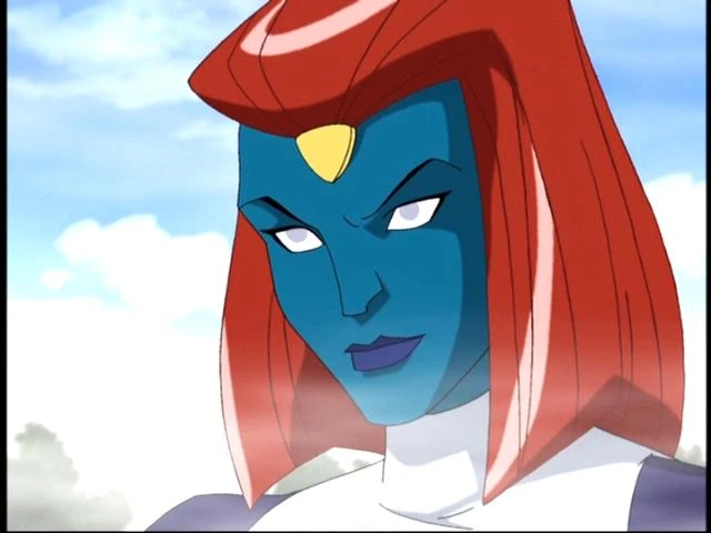
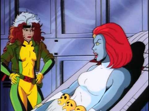
Even then it's probably best to make her even more feminine than that. As was mentioned by someone before, the show sorta intentionally give the villains a harsher style to evoke a diffrent psychological response from the audience. But for a porn game it's better to make her more conventionally attractive.
You're aiming for your audience to want to fuck her, rather than wanting to see her get punched. Unlike what the show's original artists intended.
- Dec 23, 2017
- 354
- 708
And that is an other example why for me the 90's version of the X-Men in general are the cooler ones!
Even then it's probably best to make her even more feminine than that. As was mentioned by someone before, the show sorta intentionally give the villains a harsher style to evoke a diffrent psychological response from the audience. But for a porn game it's better to make her more conventionally attractive.
You're aiming for your audience to want to fuck her, rather than wanting to see her get punched. Unlike what the show's original artists intended.

Want another one? Ok, ok
You don't have permission to view the spoiler content.
Log in or register now.
- Jun 6, 2017
- 230
- 1,194
I don't know, I think I liked the "Wolverine and the X-Men" version the most.
Anyway, here's revisions.
I know the chin was an issue for some, so I fixed that:

Here's the versions I tossed in favor of Mystiqimus Prime:


Fixed hairline for both, reduced jaw width and angle, redrew shadows to soften face and match new hair; gave Raven a barrette to keep her bangs out of her eyes and a baguette to keep the pangs (of hunger) out of her stomach.
I think the lips might be giving people some trouble too, they'll be resized when I draw the mouth set though.
Anyway, here's revisions.
I know the chin was an issue for some, so I fixed that:

Here's the versions I tossed in favor of Mystiqimus Prime:


Fixed hairline for both, reduced jaw width and angle, redrew shadows to soften face and match new hair; gave Raven a barrette to keep her bangs out of her eyes and a baguette to keep the pangs (of hunger) out of her stomach.
I think the lips might be giving people some trouble too, they'll be resized when I draw the mouth set though.
- Jan 12, 2018
- 4
- 3
Just my opinion but I think her nose should be less "squary".I don't know, I think I liked the "Wolverine and the X-Men" version the most.
Anyway, here's revisions.
I know the chin was an issue for some, so I fixed that:
View attachment 108602
Here's the versions I tossed in favor of Mystiqimus Prime:
View attachment 108598 View attachment 108599
Fixed hairline for both, reduced jaw width and angle, redrew shadows to soften face and match new hair; gave Raven a barrette to keep her bangs out of her eyes and a baguette to keep the pangs (of hunger) out of her stomach.
I think the lips might be giving people some trouble too, they'll be resized when I draw the mouth set though.
Otherwise I think she's looks pretty nice.
- Aug 10, 2016
- 69
- 144
I like where this is goingAnyway, here's revisions.
I know the chin was an issue for some, so I fixed that:
- Nov 30, 2017
- 103
- 71
The pool version looks really good!I don't know, I think I liked the "Wolverine and the X-Men" version the most.
Anyway, here's revisions.
I know the chin was an issue for some, so I fixed that:
View attachment 108602
Here's the versions I tossed in favor of Mystiqimus Prime:
View attachment 108598 View attachment 108599
Fixed hairline for both, reduced jaw width and angle, redrew shadows to soften face and match new hair; gave Raven a barrette to keep her bangs out of her eyes and a baguette to keep the pangs (of hunger) out of her stomach.
I think the lips might be giving people some trouble too, they'll be resized when I draw the mouth set though.
- May 12, 2018
- 40
- 6
H
Hey how can I get mystique to fuck.Its like no progress with her.i have maxed out all 3 girls but no progress with mystique I'm playing on Android plz guide me.shellbust101
Android version is very good
Ah yeah it's getting better. Shrinking the lips will definitely help. And yeah the nose could use some tweaking as well.I don't know, I think I liked the "Wolverine and the X-Men" version the most.
Anyway, here's revisions.
I know the chin was an issue for some, so I fixed that:
View attachment 108602
Here's the versions I tossed in favor of Mystiqimus Prime:
View attachment 108598 View attachment 108599
Fixed hairline for both, reduced jaw width and angle, redrew shadows to soften face and match new hair; gave Raven a barrette to keep her bangs out of her eyes and a baguette to keep the pangs (of hunger) out of her stomach.
I think the lips might be giving people some trouble too, they'll be resized when I draw the mouth set though.
- May 12, 2018
- 40
- 6
Is
there an update Android version.Also how to get mystique to fuck you it's harder than Emma and mystique can't be found anywhere except her room.No progress with her I think it's a bug or plz tell me how to trigger her.I need to take a break, maybe figure out why my brush tool is messed up, I'm not hand drawing these lace patterns. But here's a little update:
View attachment 107304
I got a plan @Echo-128, I'm shopping it out to the other mods right now to see if it's feasible.
