- Aug 22, 2020
- 718
- 1,423
Black, darker black, gray and dark gray. Maybe charcoal to be a little extra fiesty.Hey, I have a few different colors...
You always were the rebellious one.
Exactly! Preach it!Black, darker black, gray and dark gray. Maybe charcoal to be a little extra fiesty.
The MC is just like me, find some clothes you like, buy 5 of everything and always wear that.
Same here.The only exceptions being the shirts and drawers I buy in packs of 5 ...can't control what colors those come in. XD
Is there version without those blue save, menu etc. icons. I'm pretty annoyed by those i just want the old classic white icons backUnofficial Android Port for :
Harem Hotel [v0.14.1 Public] [Runey]
Download
Download [Apk+Obb]
ALLOW STORAGE ACCESS
My Android Ports have a 2nd Persistent save location. So, even if you uninstall the game, the saves will remain Intact.
You don't have permission to view the spoiler content. Log in or register now.
if you liked my work, support on Patreon.
You must be registered to see the links
If it says unknown developer or something like that just press install anyway.
Give Me Your Feedback on the Discord Server. As it's easier to reach me there, than here.
You must be registered to see the links
Yes. Don't do the slave route.Hello
I stopped playing this game a long time ago and have come back and seen some changes.
Does anyone know the difference between the slave route and the love route of Nia and Sylvia?
Sorry for my bad english
The love routes are canon, and have more story, but you have to wait for the sex.Hello
I stopped playing this game a long time ago and have come back and seen some changes.
Does anyone know the difference between the slave route and the love route of Nia and Sylvia?
Sorry for my bad english
I have to agree, that 'menu' could do with an overhaul in every way tbh.Back to the topic of the new charts and menus, one thing that I have been wanting for a while is bigger hit boxes on the names here.
View attachment 1602299
I can't tell you how many times I have closed the menu by missing the name by 'that much'.
View attachment 1602301
My mouse arm is disabled, so clicking exact spots can be a challenge, even when I think I have it, it will move just as I click. That is the other thing, you have a nice close button there, can that be the only way to close it, it makes it a lot less painful to miss, if it doesn't close the window too, and have to then reopen the menu.
The slave route isn't the true route, that would be the love route. Slave route assumes the player cares more about their body.The love routes are canon, and have more story, but you have to wait for the sex.
The slave route is just sex, and no story, and it's the 'true' route.
Best to do both if you want to see them, just have a page of saves just for the one, and the others for your main.
Back to the topic of the new charts and menus, one thing that I have been wanting for a while is bigger hit boxes on the names here.
View attachment 1602299
I can't tell you how many times I have closed the menu by missing the name by 'that much'.
View attachment 1602301
My mouse arm is disabled, so clicking exact spots can be a challenge, even when I think I have it, it will move just as I click. That is the other thing, you have a nice close button there, can that be the only way to close it, it makes it a lot less painful to miss, if it doesn't close the window too, and have to then reopen the menu.
I thought I had shared this here a while ago, but maybe not.I have to agree, that 'menu' could do with an overhaul in every way tbh.
Sorry, that was a typo/brain fart. I need to fix that.The slave route isn't the true route, that would be the love route. Slave route assumes the player cares more about their body.
I thought I had shared this here a while ago, but maybe not.
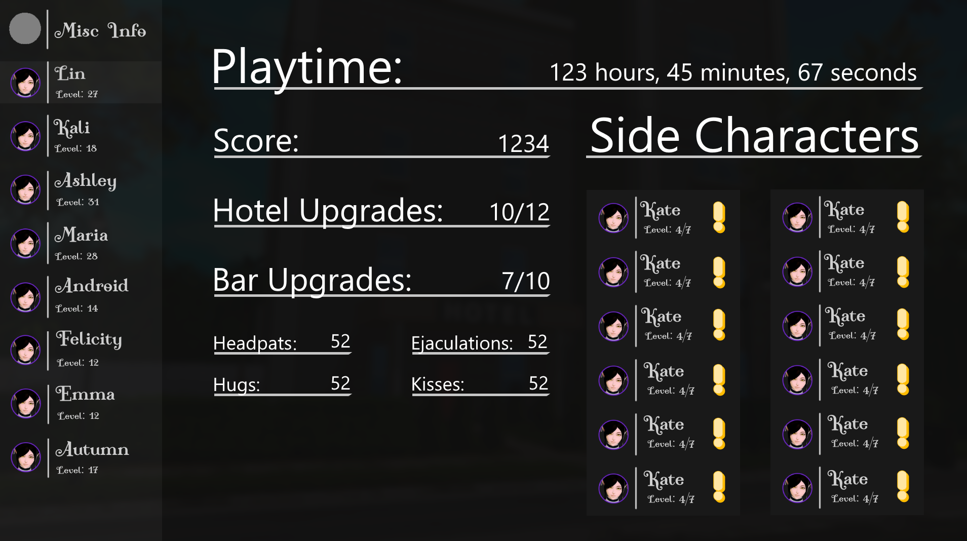
This is the concept for the new misc screen, which is what appears after you click the "i" button. It replaces that small black window.
You did, I thought that was after clicking the name. I like what you've done there.I thought I had shared this here a while ago, but maybe not.
This is the concept for the new misc screen, which is what appears after you click the "i" button. It replaces that small black window.
I was thinking the same, no idea why, I guess I should have saved the images and blown them up, with the thumbs, I didn't really pay attention to some of the details.You did, I thought that was after clicking the name. I like what you've done there.
Oh, wow, even more information, might take a little bit for the other affections to catch up with the headpats, since I doubt it will track the ones from before. XDI think I know now, which side girl Runey likes the most.
View attachment 1602408
Although they all look a lot like Lin.
I like the layout, but I'm not a fan of the font used for the girls' names, the "Misc Info" and "Close".
Oh I see, then I'll do the route love, thanks for the helpYes. Don't do the slave route.
(Scenes change, and you'll miss some things, but by this point you must know what the story wants you to do.)