3.00 star(s) 5 Votes

Vrijgeest

Engaged Member
Jun 16, 2019
3,332
3,179
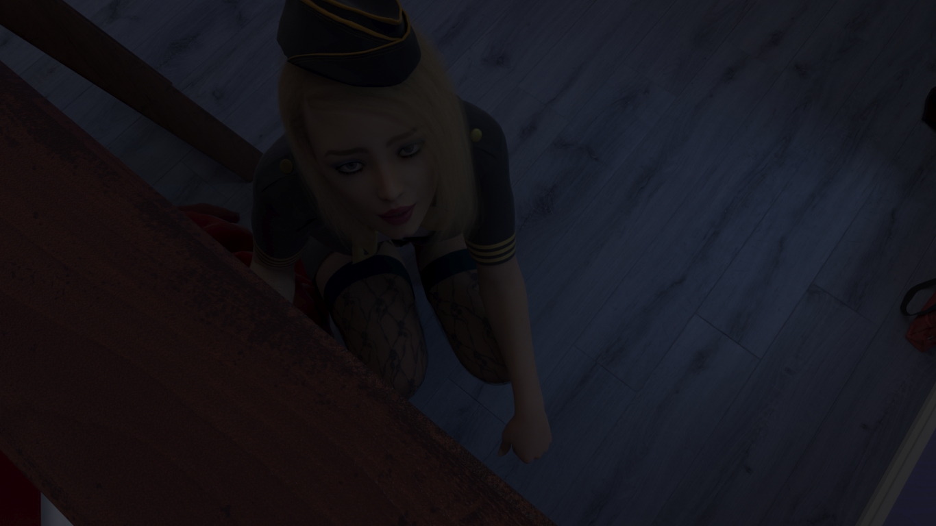
The renders are far too dark and in fact the balance between light and dark is far too great. Also why is the text scrolling when the speed is set at max. It should be instant. I hate scrolling text as it gives me head aches and also I speed read which requires instant text.
 
  • Like
Reactions: Ara-sH and F9Zoney

Vrijgeest

Engaged Member
Jun 16, 2019
3,332
3,179
I have given up. The renders were of such bad quality and the stupid text which I had changed the font of and did help it but in the end was impossible.
 
  • Haha
Reactions: TiffanyMonroe

Rintal

Active Member
May 6, 2017
849
1,915
Oh my God! It's almost impossible to read! Not only is there Engrish, but also this font...
I think I broke my eyes and my brain (although, formally, the eyes are part of the brain).
 

Penfold Mole

Engaged Member
Respected User
May 22, 2017
3,094
7,512
About the text, I played it and it seemed quite readable to me. So I decided to keep it.
Zee, respectfully, if you want to set default speed for text the way you prefer and want to let the players know about it, just use default preferences.text_cps in options.rpy file. It's already in there, set to 0 by default. This is the right way to do it.
Let the players decide by themselves if that speed is what they prefer and allow them to set the speed they prefer. Don't lock it down for them.

For me crawling text is the most annoying thing imaginable. I want to see the whole text instantly and read it as fast as possible, which is several times faster than the crawling speed you set it to.
Locking cps settings into character definitions in Ren'Py is wrong in so many levels... pretty much a definition of a dick move. Please don't do that.

"Fast enough" for one person can be painfully slow for another


I thought about trying your new game after the previous update, but after extracting and running it I wasn't in the mood of trying to find the place you locked cps, so I just left it there, never played it.
 
Last edited:

Zee95

Well-Known Member
Game Developer
Sep 17, 2017
1,326
4,692
Zee, respectfully, if you want to set default speed for text the way you prefer and want to let the players know about it, just use default preferences.text_cps in options.rpy file. It's already in there, set to 0 by default. This is the right way to do it.

Let the players decide by themselves if that speed is what they prefer and allow them to set the speed they prefer. Don't lock it down for them.

For me crawling text is the most annoying thing imaginable. I want to see the whole text instantly and read it as fast as possible, which is several times faster than the crawling speed you set it to.
Locking cps settings into character definitions in Ren'Py is wrong in so many levels... pretty much a definition of a dick move. Please don't do that.

"Fast enough" for one person can be painfully slow for another


I thought about trying your new game after the previous update, but after extracting and running it I wasn't in the mood of trying to find the place you locked cps, so I just left it there, never played it.
Roger that!
 

Zee95

Well-Known Member
Game Developer
Sep 17, 2017
1,326
4,692
Is everything really that dark? Seriously? Is it really necessary to lighten everything up and make it a fake night? Nah, guys... I want to make games so you can feel the atmosphere... maybe someone is against it, maybe everyone is against it, but sorry, I'm not changing the night scenes... although who does 3d graphics understands that even in night scenes there are fake lights that illuminate the main view... Also in my game, the night scenes have fake light...
1a 116-5_01.jpg
 

woody554

Well-Known Member
Jan 20, 2018
1,544
1,922
unlike some others I do like the idea of dark renders when it's supposed to be dark, and frankly these are still bright for that. but I think it would improve your renders a lot to work on your lighting just a little bit. it's very flat now, there are hardly any shaping lights. put on some dim cold backlights to draw out the shapes. never light things evenly from every side, have one side (usually where the window is) dominate, and fill the other side only slightly to not have it digital black, but never even close to as bright as the light side.

using colors helps a lot too. often the light coming from outside should be blueish and indoors light reddish, so even a faint light will help you differentiate things on the screen. backgrounds bluish, foregrounds reddish. doesn't REALLY matter which colors you use (on csi miami everything was famously yellow and green), the realism ALWAYS comes mainly from contrasts rather than actual hues. ther is no such thing a 'skin color', skins can be even green if your contrasts and values are right.

so try to have contrasts, it makes the image read much better. also you can put a LOT more blue light into the image and it'll still feel 'dark'. so you end up seeing much more than with white light. don't overdo it unless you want that crazy look, but you'll see what I mean when you try it. I think it's because darkness is always grayer than daylight, so our brain interpretes monochromatic light as 'darkness'. whatever it is, it works.

use very dark areas as well, everything doesn't have to be visible. I even make renders where you deliberately can't see facial features at all, and it's more about the backlight drawing out the outlines of the bodies.

you can even have extremely bright lights and still have the image look like it was in the middle of the night. it's never about the physical brightness of the lighting but creating cues for the brain to interprete things into a certain context. think of film noir. also think about lighting more as sculpting with light than 'switching on lights in the room'. it's not about seeing every pixel, it's about conveying a mood and drawing out shapes.
 
  • Like
Reactions: Ara-sH

Bip

Active Member
Donor
May 4, 2017
734
2,105
...
using colors helps a lot too. often the light coming from outside should be blueish and indoors light reddish, so even a faint light will help you differentiate things on the screen. backgrounds bluish, foregrounds reddish.
...
Very personally, I would not play with the colors of the light but with the temperature. I don't hesitate to put 10.000K for an outdoor light and 5.000 or 5.400K for indoor light.

For the rest, I tend to agree ;) . But having a HDR 4K monitor, I fucking hate dark areas in 8 bits :ROFLMAO:
 
  • Like
Reactions: TiffanyMonroe

Zee95

Well-Known Member
Game Developer
Sep 17, 2017
1,326
4,692
unlike some others I do like the idea of dark renders when it's supposed to be dark, and frankly these are still bright for that. but I think it would improve your renders a lot to work on your lighting just a little bit. it's very flat now, there are hardly any shaping lights. put on some dim cold backlights to draw out the shapes. never light things evenly from every side, have one side (usually where the window is) dominate, and fill the other side only slightly to not have it digital black, but never even close to as bright as the light side.

using colors helps a lot too. often the light coming from outside should be blueish and indoors light reddish, so even a faint light will help you differentiate things on the screen. backgrounds bluish, foregrounds reddish. doesn't REALLY matter which colors you use (on csi miami everything was famously yellow and green), the realism ALWAYS comes mainly from contrasts rather than actual hues. ther is no such thing a 'skin color', skins can be even green if your contrasts and values are right.

so try to have contrasts, it makes the image read much better. also you can put a LOT more blue light into the image and it'll still feel 'dark'. so you end up seeing much more than with white light. don't overdo it unless you want that crazy look, but you'll see what I mean when you try it. I think it's because darkness is always grayer than daylight, so our brain interpretes monochromatic light as 'darkness'. whatever it is, it works.

use very dark areas as well, everything doesn't have to be visible. I even make renders where you deliberately can't see facial features at all, and it's more about the backlight drawing out the outlines of the bodies.

you can even have extremely bright lights and still have the image look like it was in the middle of the night. it's never about the physical brightness of the lighting but creating cues for the brain to interprete things into a certain context. think of film noir. also think about lighting more as sculpting with light than 'switching on lights in the room'. it's not about seeing every pixel, it's about conveying a mood and drawing out shapes.
1a 116-5_3.jpg
Thanks for the advice... This scene has everything you wrote about... Multiple light sources, soft light, enveloping light, blue light, just look at the reflections... the dark areas, and I don't agree that the picture looks flat. As there is also contour light in the scene...
But I'm not going to insist that I'm great at setting up light sources... honestly I like my work, I could make it even better, spending more time, but time is a luxury I can't afford at this "time"
 
  • Like
Reactions: Ara-sH

Vrijgeest

Engaged Member
Jun 16, 2019
3,332
3,179
Even in the film industry night scenes are never totally real. There are tricks to lighten them up. I can play around with my video card settings but that is not the ideal answer. Devs should better balance their renders. Lighting is always a big problem in any media. Just some devs seem to be better at it.
 

Zee95

Well-Known Member
Game Developer
Sep 17, 2017
1,326
4,692
1a 116-5_4.jpg
This is what the light settings look like in this rendering... On the right...
 
3.00 star(s) 5 Votes