Fan Art Dating My Daughter: Fan Art

5.00 star(s) 2 Votes

CulayTL

Sneaky Bastard
Donor
Game Developer
Jan 31, 2018
4,385
35,560
V3:
7_intel_002_result.jpg

V2:
fff_intel_001.png

V1:
fff_intel_001.png
Feedback?

Had in plan the yoga thing but after browsing a bit on a torrent site found this.. ok.. I ll give it a try.
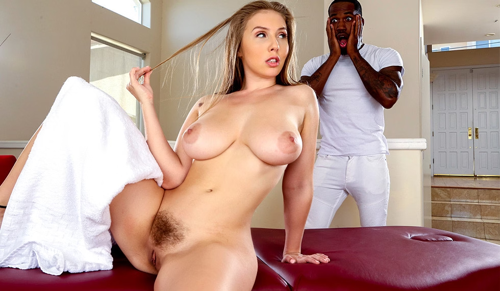

Wanna work more on him.. some more skin features, work more on sausage but got lazy to simulate over and over again.. for some reasons I don't like to play with male characters that much.
Maybe improve the room a bit more.. drag a wall behind and remove the right window..
Add a backdrop but I don't really know how reduce/remove the window reflections
In rest I think it looks decent.. or does it?
 

fried

Almost
Moderator
Donor
Nov 11, 2017
2,313
6,093
Some camera/lighting tests..
Not sure why but the hair looks really bad for some reasons..
No daz denoise.. at least that was my 1st thing that came in my mind why it looks like that..

View attachment 412837 View attachment 412838

Same chars I used in the renders above Daddys Princess
If you wondered how Daddy looked on those renders.. btw he doesn't have the head there
Nice ideas there.

Are you going for non-MrDots-style lighting, essentially?

On the ponytail, those can be weird in real life, too.

Ponytail without a tilt:


Ponytail with a tilt:


The differences are subtle - usually I see the ponytail slightly curving forwards at its middle when the head is tilted back, which is happening above and is more obvious here:


But, it also depends on where the ponytail base is on the back of the head:
 

CulayTL

Sneaky Bastard
Donor
Game Developer
Jan 31, 2018
4,385
35,560
Nice ideas there.

Are you going for non-MrDots-style lighting, essentially?

On the ponytail, those can be weird in real life, too.

Ponytail without a tilt:


Ponytail with a tilt:


The differences are subtle - usually I see the ponytail slightly curving forwards at its middle when the head is tilted back, which is happening above, but more obvious here:
Mostly yeah.. father-daughter not my thing either.. mom/aunt - son/daughter maybe..
 

roadtrip

Newbie
Sep 1, 2019
47
303
Wanna work more on him.. some more skin features, work more on sausage but got lazy to simulate over and over again.. for some reasons I don't like to play with male characters that much.
Maybe improve the room a bit more.. drag a wall behind and remove the right window..
Add a backdrop but I don't really know how reduce/remove the window reflections
In rest I think it looks decent.. or does it?
Really like the idea, and like you F/d not my thing but Dee have her charm :love: yeah the guy look good imo, for the room improvement maybe use a separator sadly i don't know the word in english but like the one their use to hide to remove cloth /\/\/\ <- this form :LOL: for lack of better word, as for the reflection maybe simply delete the windows and render with transparency and add the backdrop in Photoshop in post processing but yeah the composition is great imo and a spa is most of the time clean of clutter for zen purpose lol so no need to overcrowd the room with detail anyhow i like

found the word their call it screen

as exemple


CulayTL

Sneaky Bastard
Donor
Game Developer
Jan 31, 2018
4,385
35,560
Really like the idea, and like you F/d not my thing but Dee have her charm :love: yeah the guy look good imo, for the room improvement maybe use a separator sadly i don't know the word in english but like the one their use to hide to remove cloth /\/\/\ <- this form :LOL: for lack of better word, as for the reflection maybe simply delete the windows and render with transparency and add the backdrop in Photoshop in post processing but yeah the composition is great imo and a spa is most of the time clean of clutter for zen purpose lol so no need to overcrowd the room with detail anyhow i like
There is a separator on this one as well.. mostly all the props are from there..


The room is this one


Thinking now to change the window frames as well.

as for the reflection maybe simply delete the windows and render with transparency and add the backdrop in Photoshop in post processing
Found it.. select the window in the surfaces and lower the refraction index..
Did that previously but actually I had selected the full wall..
 
Last edited:

fried

Almost
Moderator
Donor
Nov 11, 2017
2,313
6,093
Mostly yeah..
For MrDots-style lighting, I am no expert, but I feel your massage picture above is closer than those two experiments.

Essentially, he minimizes hard shadows and keeps a relatively consistent brightness throughout the scene with relatively flat skin - this is the style of lighting and textures, IMHO:
https://f95zone.to/threads/dmd-dating-my-daughter-art-assets-thread.4306/page-13#post-1763896

That was a lighting coverage test for the models, but doesn't fully emulate the brightness levels or color saturation we typically see in his images. That's probably not difficult to do as the next step, but I honestly got lazy and went onto other things (I should get back to fanart and try to improve myself there ...). Also, if I wanted to be completely accurate to DMD, I would need to render that in Iray.
 

CulayTL

Sneaky Bastard
Donor
Game Developer
Jan 31, 2018
4,385
35,560
I'm just trying to add a light that would match with the enviroment as well and with characters as well..
Now.. massage scene should be something relaxing and warm..
Dee works nice with a warm light as well..
On this one the only light I used was a HDR one..
https://f95zone.to/threads/realistic-lighting-for-iray.37568/
Intensity 1 (default)
Enviroment map 1.5 from 2
Dome on and dome rotation 30

Probably I would have to add another one to focus males body as well.. it's a bit in the shadow.. of course female it's more important but oh well .. he s in the secene as well.
 

fried

Almost
Moderator
Donor
Nov 11, 2017
2,313
6,093
I'm just trying to add a light that would match with the enviroment as well and with characters as well..
Oh, I thought you were implying otherwise in response to my question, sorry.

Now.. massage scene should be something relaxing and warm..
Dee works nice with a warm light as well..
On this one the only light I used was a HDR one..
https://f95zone.to/threads/realistic-lighting-for-iray.37568/
Intensity 1 (default)
Enviroment map 1.5 from 2
Dome on and dome rotation 30

Probably I would have to add another one to focus males body as well.. it's a bit in the shadow.. of course female it's more important but oh well .. he s in the secene as well.
The lighting coming through those windows seems kind of overpowering - to the point of creating strong highlights on the D character. It might be that a background through the glass could help help tone it down a tad. The shadows feel as if they are coming from at least two different directions - maybe a hidden near wall and/or part of the ceiling.

Might want to consider cropping the view down, that room looks vast (and empty behind them?)

I agree that the male character seems a bit muted in comparison, but part of that might be because D is getting all that window-transmitted lighting.
 

CulayTL

Sneaky Bastard
Donor
Game Developer
Jan 31, 2018
4,385
35,560
Oh, I thought you were implying otherwise in response to my question, sorry.


The lighting coming through those windows seems kind of overpowering - to the point of creating strong highlights on the D character. It might be that a background through the glass could help help tone it down a tad. The shadows feel as if they are coming from at least two different directions - maybe a hidden near wall and/or part of the ceiling.

Might want to consider cropping the view down, that room looks vast (and empty behind them?)

I agree that the male character seems a bit muted in comparison, but part of that might be because D is getting all that window-transmitted lighting.
Yeah.. well my ideea was to get some natural light from the window and some lights in the room as well.
There's no ceilling I might have to add something on the top and some other walls left/right to stop some lights coming from those directions.
There's only one wall atm and the ground.

Screenshot 2019-09-28 03.22.28.png

//think I found the problem .. the window it's a big one but the curtain it's smaller than the window..

Screenshot 2019-09-28 03.42.34.png
shh! nobody knows..
 
Last edited:

RustyV

Conversation Conqueror
Game Developer
Dec 30, 2017
6,926
33,054
Nice ideas there.

Are you going for non-MrDots-style lighting, essentially?

On the ponytail, those can be weird in real life, too.

Ponytail without a tilt:


Ponytail with a tilt:


The differences are subtle - usually I see the ponytail slightly curving forwards at its middle when the head is tilted back, which is happening above and is more obvious here:


But, it also depends on where the ponytail base is on the back of the head:
Think of the ponytail like a pendulum.
Because the head is round (and female skulls more than males*) the attachment point of the ponytail combined with the position of the skull will dictate the swing of the pendulum.
male-skull-vs-female-skull.jpeg
*trivia from my archaeology classes at college.
 
Last edited:
  • Like
Reactions: fried and CulayTL

goobdoob

Conversation Conqueror
Modder
Respected User
Dec 17, 2017
7,426
9,693
Nice work.
Will there be a Spaghetti Western D ?

Have Boobs Will Travel.
Two Big Boobs for Sister D.
A Shirt Full of Boobs.
Treasure of the D Madre.
The Good, the Bad and the D.
Two Mules for Sister D.
El D-rado
D Wore a Yellow Ribbon
HonD
Red River (that time of month)
 
  • Like
Reactions: Ruffuss and RustyV

CulayTL

Sneaky Bastard
Donor
Game Developer
Jan 31, 2018
4,385
35,560
https://f95zone.to/threads/dating-my-daughter-fan-art.4315/page-145#post-2453470
Updated the main one..

Not happy with the backdrop but in rest I'm ok with that.
There's one small reflection on the table that shouldn't be there left bottom corner.
Towel clips a bit with the table.. I think it's the table broken because first I tried to add dform on it with the character and the lowest settings it was like a few cm away from the character.. dunno.. tried to simulate again and again getting the same results
The light it's the same, didn't added anything more just touched the skin on the male and added a few (maybe a bit too much) muscles.. mostly all done with skin reflections.

Thank you all again for the feedback!
Oh.. sry.. tried to keep the same camera/pose didn't had place for the separator.. but you can imagine it's somewhere in the back.. :ROFLMAO:
 

pat11

Well-Known Member
Jan 1, 2019
1,358
7,528
Nice work.
Will there be a Spaghetti Western D?

Have Boobs Will Travel.
Two Big Boobs for Sister D.
A Hand Full of Boobs.
i already planned since 1 month to make a story for my patreon, with this theme, but as i started to post my art in this thread, i just wanna share my view of DMD in this theme, today i will make few more renders in this theme, with other DMD girl for sure, Elena, Rachel, Cassandra, Georgina
 

CulayTL

Sneaky Bastard
Donor
Game Developer
Jan 31, 2018
4,385
35,560
So it's been three years? Trifecta time?

Doggies, Dickgirls, and DaYetiSomething...


The Yeti shaved just for Dee!
Actually, I haven't upgraded my Daz
install in a while, so I don't have the
new Hair plugin thingie...
Do you have her number?
"for a good time.,.."
Didn't see that 1st, I was on phone.

About daz 4.12
Had one unexpected error yesterday followed by crash on the massage scene.. switching from iray preview and back..
I feel there's less lag or maybe it's just me.. rendering time seems to be quite the same..
 
  • Like
Reactions: OhWee

RustyV

Conversation Conqueror
Game Developer
Dec 30, 2017
6,926
33,054
So it's been three years? Trifecta time?

Doggies, Dickgirls, and DaYetiSomething...


The Yeti shaved just for Dee!
Actually, I haven't upgraded my Daz
install in a while, so I don't have the
new Hair plugin thingie...
So which one of D's sex playmates gets her pregnant? :D

Graffiti on the overpass column was a creative touch.
 
  • Like
Reactions: OhWee
5.00 star(s) 2 Votes