3D-Daz Daz3d Art - Show Us Your DazSkill

5.00 star(s) 13 Votes

Deleted member 24507

Well-Known Member Amateur Artist 3D
Donor
May 5, 2017
1,636
6,580
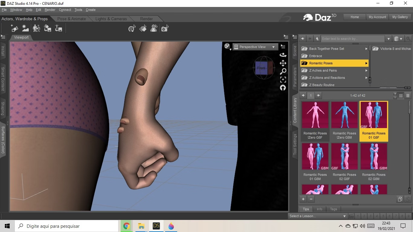
what is the best way to combine characters in a scene?
I am using for example a ready model of POSE of a couple, but still they still have errors of union! The Characters are the same height and size percentage 96%!

1.jpg


I know you can adjust it manually, but I would like to know a faster and more practical way! thanks
 
  • Like
Reactions: SummmerP

SummmerP

(un)killed in action
Game Developer
Jun 26, 2017
1,239
4,050
what is the best way to combine characters in a scene?
I am using for example a ready model of POSE of a couple, but still they still have errors of union! The Characters are the same height and size percentage 96%!

1.jpg


I know you can adjust it manually, but I would like to know a faster and more practical way! thanks
No idea. I have to do it manually every single time.. rarely they match, and I must always do it manually.
Feels great.
 

Sakrilas

Just Another Member
Game Developer
Oct 26, 2017
362
2,643
I posted this in the Fashion Business Fan Art thread, but I thought that it would be okay to share it here too.

Here are the last renders I created:

1.1.png
1.3.png
1.4.png


Some problems I realized after I was done with the renders: (I would appreciate if anyone has suggestions on how to address these)
You don't have permission to view the spoiler content. Log in or register now.


I'm trying to learn DAZ and It's been a lot of fun. The more tutorials I watch the more I see how far this rabbit hole goes, and this is a great feeling.
I was wondering what concepts you think I should focus on to improve my scenes. Lighting? Camera settings? Something else? Any kind of tips or feedback is more than welcome.

In regards to these images, here are some possible red flags that I need to learn how to address:
  • I didn't do any light tweaking other than moving the sun around.
  • I didn't do any camera tweaking other than moving and creating cameras around.
  • I didn't do any render tweaking, other than activating post denoiser filter from sampling count 4000 to 5000.
 
Last edited:

pewpewrobot

Member
Sep 4, 2017
111
206
I posted this in the Fashion Business Fan Art thread, but I thought that it would be okay to share it here too.

Here are the last renders I created:

View attachment 1045001
View attachment 1045003
View attachment 1045004


Some problems I realized after I was done with the renders: (I would appreciate if anyone has suggestions on how to address these)
You don't have permission to view the spoiler content. Log in or register now.


I'm trying to learn DAZ and It's been a lot of fun. The more tutorials I watch the more I see how far this rabbit hole goes, and this is a great feeling.
I was wondering what concepts you think I should focus on to improve my scenes. Lighting? Camera settings? Something else? Any kind of tips or feedback is more than welcome.

In regards to these images, here are some possible red flags that I need to learn how to address:
  • I didn't do any light tweaking other than moving the sun around.
  • I didn't do any camera tweaking other than moving and creating cameras around.
  • I didn't do any render tweaking, other than activating post denoiser filter from sampling count 4000 to 5000.
I am also learning Daz and it's been a blast so far. Your photos look great, but the first one up close looks best. The other two look a little off because of the water effect on the girl. It might be lighting causing it, and i have no idea how you would fix it.

The billboards don't look bad, i honestly didn't know until you pointed it out. I might have been looking at your main subject... I do think you could fix the shadow issue with a small spot light on low pointed in the right direction or at lest not have a shadow in the buildings shadow at all. I mean who do they think they are, Shikamaru???
 
  • Red Heart
Reactions: Sakrilas

Sakrilas

Just Another Member
Game Developer
Oct 26, 2017
362
2,643
I am also learning Daz and it's been a blast so far. Your photos look great, but the first one up close looks best. The other two look a little off because of the water effect on the girl. It might be lighting causing it, and i have no idea how you would fix it.

The billboards don't look bad, i honestly didn't know until you pointed it out. I might have been looking at your main subject... I do think you could fix the shadow issue with a small spot light on low pointed in the right direction or at lest not have a shadow in the buildings shadow at all. I mean who do they think they are, Shikamaru???
Oh! I see what you mean, yeah, the lighting on the water droplets caused some weird effect from that angle. That's going to start bothering me now hahah.

About the billboards, thanks! Yeah, I tried my best to just have them at non-important/filler locations, for example, the 2 random pedestrians closest to the main characters are also 3d models, because they were too close for me to feel comfortable sticking with billboards. I did a similar thing with the cars, the closest one is high resolution, while the ones far away are very low resolution.

The idea of putting some lighting to force them to cast the shadows I want them to cast is pretty interesting! I'll try it out, thanks!
 
  • Like
Reactions: pewpewrobot

pewpewrobot

Member
Sep 4, 2017
111
206
Oh! I see what you mean, yeah, the lighting on the water droplets caused some weird effect from that angle. That's going to start bothering me now hahah.

About the billboards, thanks! Yeah, I tried my best to just have them at non-important/filler locations, for example, the 2 random pedestrians closest to the main characters are also 3d models, because they were too close for me to feel comfortable sticking with billboards. I did a similar thing with the cars, the closest one is high resolution, while the ones far away are very low resolution.

The idea of putting some lighting to force them to cast the shadows I want them to cast is pretty interesting! I'll try it out, thanks!
Remember to show your work to the class when you are finished!
 
  • Like
Reactions: Sakrilas
5.00 star(s) 13 Votes