This VN has qualities that almonst no other has in this site. I explained some of that here:
https://f95zone.to/threads/high-life-ep-1-erosion.15637/page-84#post-3214185
But I will go farther this time. It's not about the renders only, this VN is a gem for those who understand cinema.
I will do now a comparission between this and
A Wife And A Mother, a VN well known for its great renders.
Let's talk about the photography department, where the differences are more significant:
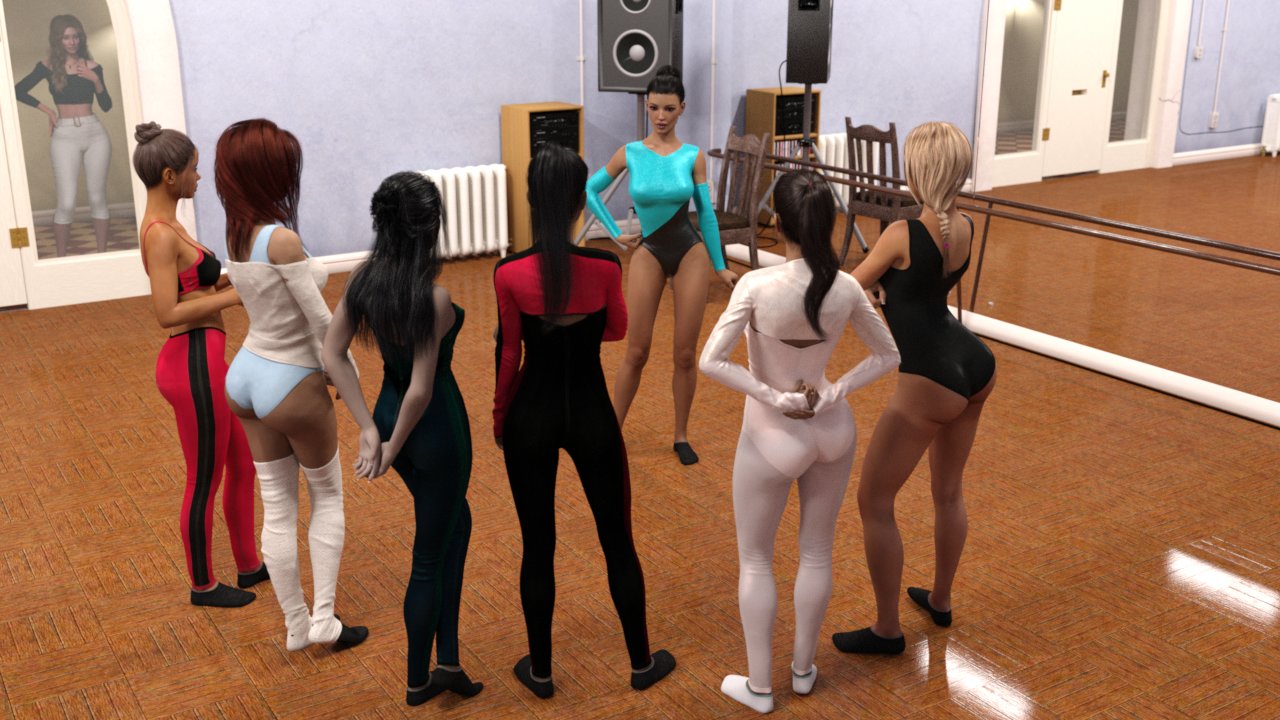
A dancing class scene:
View attachment 664437
At the left, from AWAM, we have an unattractive shot: the angle is not the best, it's from above and there are a lot of free space at the sides, you see unnecessarily so much floor and mirror. The image is not well balanced.
At the right, from High Life, they tell us the same with a better angle and composition. In addition, you can perceive the sunlight coming from the windows, reflected on the clothes and the floor, generating contrast, which give us a more charming and aesthetic image.
Dancing at party scene:
View attachment 664523
View attachment 664528
In both places we perceive a lot of people. But they are distributed different. In AWAM, at the left, we see too much free space again, too much empty floor. The open shot isn't only unnecessary but give us a poor image. Those colour lights are unattractive too.
On the other hand, in High Life, at the right, with a closer shot they show us less amount of people but we feel that the place is full of them. We can perceive a better party atmosphere, people dancing closer, and with that neon light at the background we identify that the place is a club, an open shot isn't necessary to understand that they are in the dancing floor.
View attachment 664572
View attachment 664570
View attachment 664578
View attachment 664563
In these other images, we can perceive the same thing. In AWAM the background is almost empty, we see more about the chairs than the people. Despite we know that there are a lot of them in the place but they are distributed wrongly.
In High Life, on the other hand, we can even see people laughing at the background, a better party atmosphere again, a vivid one. In addition, we have a closer and proper shot for the person in whom the interest is placed in that moment, we will remember them better. Also we can see that the shots have more shallow depth of field (the background highly unfocused), which let us concentrate more in the character and generates a more aesthetic image. Besides, we see images richer in colours and textures.
The most VNs have a latin soap opera's photography: the lighting tends to be plain, without contrast, all the frame in focus and with poor composition. High Life has a more cinematic photography, which includes beautiful medium close-ups like this one:

