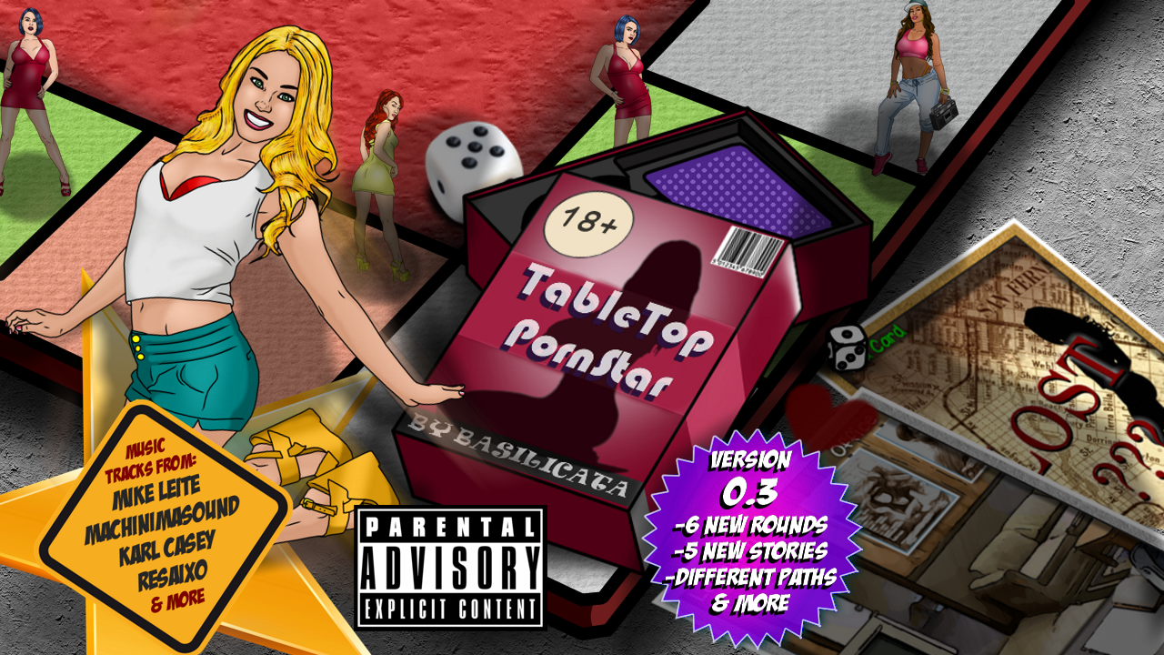
About the uncanny valley, he might be right. Although, I ve received a lot of compliments for the artwork, I understand that there's a reason my games aren't that popular. And that might as well be the art. It's a question of taste. Nothing I can do about it except keep working at it. I play the early chapters of Goss_ip now and I too find my art off. But as the chapters go by I keep getting better at it.
Let me elaborate then.
It is super obvious that the artwork is just tracing over still shots of real pornography.
How? A few things. For one, the proportions and perspective is near perfect. Not in and of itself a bad thing, but when combined with line work and shading that is so much less impressive and lesser quality, it stands out. These aren't original character designs from someone expressing any original artistic style or flair. Rather it looks like the work of someone with middling experience with image editing software, doing their best to copy someone else's work, without the skill to do the duplicate justice. It's like looking at a not terribly skilled elementary school student try to draw their favorite Disney characters from memory; it is a crude simulacrum of the original. The proportions are spot on because the original pictures were of real people, but the linework is far behind what you'd expect from someone capable of doing that without needing to trace over reality.
Look at the demo screenshots from the OP. The second one, with the two girls in bikinis. The girl on the right, why draw her ribs? Linework indicates emphasis, it draws attention to things. You use it to denote sharp edges or the outline of shapes. Unless the girl in the original pornography was suffering from dangerous levels of malnourishment that caused her ribcage to be almost skeletal in appearance, you shouldn't be emphasizing her ribs like that with line work. Maybe some light shading, but those lines draw attention to her ribs; and make them stand out against how otherwise lacking in lines the rest of her arms, legs, and torso are. Is she scarred? Does she have a series of thin tattoos? Are those cuts? Has see been attacked by a giant cat or a ninja? If not, those lines across her torso are really inappropriate.
Likewise the hair on both girls. The exterior outlines doesn't match the colorwork. Again, because this isn't an original piece where the artist is trying to give life to uniform design. Rather it is an outline dictated by whatever photo was traced. The interior coloration and shading doesn't mesh well with the outline. It doesn't look like hair, or an artistic representation of hair but rather a textured wallpaper wrapped around an oblong shaped mass of something.
In that same picture, the girl on the left with the pink hair; why is her jawline so crooked and frumpy? I mean, does she really have jowls, or so so much extra fat/skin just hanging off her face so as to like the view of her jaw in profile a squiggly line? Again, it's weird details and emphasis like that that makes it super uncanny valley. There are really odd choices in the linework that give emphasis and draw attention to details and imperfections that are present in the underlying photo. But those same details, when stripped away from photorealism, just do not translate well at all into comic-book styled shading.
How about the fourth pic, the girl with the red top. The top row, the center headshot, where she is looking back over her shoulder at the camera. What is wrong with her face? It looks like part of it is simply missing, as if someone took a lightsaber of cleaved off the rest of her head that stuck out past the edge of her left eye and mouth. I'm sure that it looks far more appearing in the original picture, but something here was lost in translation, and that linework just looks awful. It doesn't look sultry, hiding her face beneath her hair; it looks more like a chunk of her head is simply missing.
At the end of the day, if you started with someone who already had a good solid grasp on linework and drawing the human figure, then asked them to trace pornography, it would look so much better and less disturbing than this. Someone with a better understanding a grasp of the fundamentals would know when to trace, when not to trace, and where to fudge things to make a good looking line drawing.
If you want to improve the art in your projects, I'd implore you to actually study and practice the fundamentals. Maybe sign up for a introductory level drawing class at a community college, or anyplace else that might offer tutoring or classical instruction.


