Not terribly familiar with AI-generated world maps, but this looks more like typical 3D render assets to me. What's the obvious tell? (also, the artist has a YT page showing their work for at least one of the characters. Granted you're specifying map and environments but still...)game looks ok but it should have the AI cg tag.. the world map is so obviously AI and i suspect some of the environments are too
blackjackmuffin
Member
- Oct 10, 2022
- 240
- 124
- 175
enuig
Newbie
- Oct 29, 2017
- 20
- 84
- 291
The map, portraits, and UI elements are definitely AI. They have exactly the sepia-tinted overlap that comes with AI-generated images. It sounds like the character work is original.Not terribly familiar with AI-generated world maps, but this looks more like typical 3D render assets to me. What's the obvious tell? (also, the artist has a YT page showing their work for at least one of the characters. Granted you're specifying map and environments but still...)


Where are the first pair of panties (presumably Lily's)? I have the second and third pair, as well as the green amd red lenses. I have gone through the game twice and they have eluded me both times.
Also, on one of the two playthroughs the "extra" images vanished after loading a save.
Also, on one of the two playthroughs the "extra" images vanished after loading a save.
Nice visuals, even though the backgrounds are overdoing it with the porn parody elements.
Writing is fine, but could be more crisp.
70's is fun, but I don't feel the game quit nails it; could be more prominent in the character design.
Gameplay, well. The time mechanic at the moment really doesn't do anything so maybe a little bit tedious for no reason.
Most importantly though it's the 15.231th Harry Potter parody, which just feels thoroughly uninspired at this point.
Sepia tint isn't really an AI-specific thing, though. Sure it's common in AI images, but like all AI that's because it's a common aesthetic/design choice in other art. Particularly art aimed at having a warmer, older feel. Like say, an HP game that's set in the 60's and 70's as it mixes that old time-y feel of sepia photography with newer color photography of the period that would use dyes that fade with time.The map, portraits, and UI elements are definitely AI. They have exactly the sepia-tinted overlap that comes with AI-generated images. It sounds like the character work is original.
View attachment 5392427
View attachment 5392428
As much as AI-art annoys me for various reasons, this feels a bit more like chasing windmills than an accurate identification of AI art. The most questionable part to me would be the middle building of Hogsmeade, but that may have also just been a matter of getting sloppy with small details/not having time/forgetting to go back and fix it. Maybe you're right, but the evidence seems pretty weak and to me there's no sense taking work in bad faith when its clear there's an artist that's been dedicating her time to the character design already.
The real test is going to be if it can run to completion and do it well or not. might be the 15231st HP porn parody game, but there's like 15230 unfinished or poorly executed HP porn parody games before it. But they also took the effort to not rehash the same basic standard HP setting and went with a different time period so that's at least a fresh take on top of the more interesting character designsMost importantly though it's the 15.231th Harry Potter parody, which just feels thoroughly uninspired at this point.
Sepia tint isn't really an AI-specific thing, though. Sure it's common in AI images, but like all AI that's because it's a common aesthetic/design choice in other art. Particularly art aimed at having a warmer, older feel. Like say, an HP game that's set in the 60's and 70's as it mixes that old time-y feel of sepia photography with newer color photography of the period that would use dyes that fade with time.
As much as AI-art annoys me for various reasons, this feels a bit more like chasing windmills than an accurate identification of AI art. The most questionable part to me would be the middle building of Hogsmeade, but that may have also just been a matter of getting sloppy with small details/not having time/forgetting to go back and fix it. Maybe you're right, but the evidence seems pretty weak and to me there's no sense taking work in bad faith when its clear there's an artist that's been dedicating her time to the character design already.
youre being very charitable. and yes, we dont know for sure.
but its also a very big stylistic departure from the character models and indoor environments, which are all very saturated and colorful. its also extremely similar to every single prompt ai generated image from the last year, ever since the Great Ghibli Trend forever colored every ai image a piss yellow

Bullyoukos
Newbie
- Jun 22, 2019
- 33
- 80
- 169
Unless there've been even more improvements to AI image generation, I'd say that the map is not AI. Usually, if an AI created such a distant shot, it'd mess up perspectives, like, a tree would be bigger/smaller than the rest, or one of the houses would be generated with a really long wall. Or a chimney would be at the wrong spot.The map, portraits, and UI elements are definitely AI. They have exactly the sepia-tinted overlap that comes with AI-generated images. It sounds like the character work is original.
You don't have permission to view the spoiler content. Log in or register now.
I want to believe that it is AI, 'cause that'd mean it's got even better. The colouring itself isn't an indicator because if the creator knows to painstakingly go through and fix the typical AI mistakes, of which I see none, they'd know to tweak the tone as well. No, whether AI or not, the sepia tone is 100% a choice.
BC
Newbie
- Jul 13, 2017
- 56
- 152
- 265
possibly? couldve hired someone. well worth the cost, I'm sure.Damn that's her the dev ?
1. The map is very obviously, well a map. Something on paper or parchment that would likely be more yellowed, i.e. giving it a sepia tint seems like a very predictable artistic design choice.youre being very charitable. and yes, we dont know for sure.
but its also a very big stylistic departure from the character models and indoor environments, which are all very saturated and colorful. its also extremely similar to every single prompt ai generated image from the last year, ever since the Great Ghibli Trend forever colored every ai image a piss yellow
View attachment 5393918
View attachment 5393926
2. Everything outside of the picture of Phineas Black is closer to the normal saturated colors than being sepia washed. So again, seems like a fairly predictable design choice for that photo specifically. Or rather, the photos and papers in general, as even just looking at the background of the preview pics, all papers and pictures seem to be slightly sepia/yellowed.
3. I'm half expecting this is a troll post because those example AI images are so egregiously different in their use of sepia tones they seem to be strengthening an argument that the map and picture examples given are human made and not AI generated. Unless, perhaps, you're argument is insisting sepia is a reasonable indicator of possible AI images and the artist just generated the image of Phineas and then drew their own frame around it.
So no, I don't think I'm being particularly charitable in assuming this is likely an actual persons work and not just a well-crafted/refined prompt. Just making a reasonable assessment of what's presented instead of jumping on vague trends in AI generation and assuming the most reasonable conclusion is AI.
Are there mistakes in details in the map? Yes, but nothing particularly out of the ordinary from what you'd see in mistakes of details of landscape drawings from people. The tree by the Forbidden Forest label just looks like they started drawing the bushes on the wrong layer so some of it went on top of the tree instead of behind it but it blended in well enough it missed correction. A possible similar layering mistake on the bush/tree by the rock near the Hogwarts label, and the building in the center of Hogsmeade that looks off (though looking more closely, that may just be looking worse than it is because the roof of the back building maybe has a line missing where the roof should end and the wall begins making it feel like those houses are melting together more)
The finer details in the background of the Phineas Black portrait are also pretty atypical of AI generation, as those sorts of vague, background details are exactly the sort of thing you'd expect to be nonsense upon closer inspection, but each of the portraits in the background behind Phineas are clearly square, and identifiably head shots of presumably other witches and wizards in the Black family.
enuig
Newbie
- Oct 29, 2017
- 20
- 84
- 291
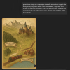
I am not saying to have a go at the creator. Just that I would be shocked if the art assets were not AI. They are either AI, or it is an artist emulating the style of AI generation.
I'm not say that that is a problem. The artist is free to use AI.
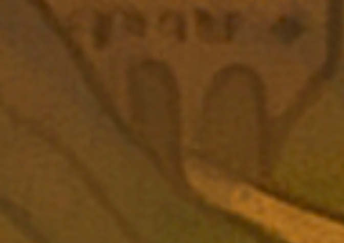
For example, there there two doorways for one road. The road is poorly aligned with both doorways, and one of the doorways is basically in the mountains.
It's not the sort of thing an artist does, even when they are being sloppy. This is what an AI does. It doesn't really know that roads and doorways should make sense. It's patching together other images.

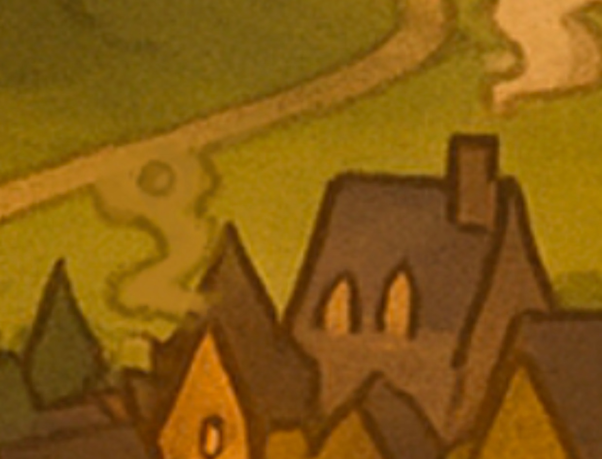
As well, There parts of the map that cannot decide whether they want to be part of the road (which is connected to the above) or whether they want to be smoke from one of the houses.
You get this from an AI. The image that I generated has a very similar issue.

There are also weird artefacts on things like the buttons. These aren't really what you get from an artist free handing stuff and being sloppy. They're what you get from an AI.

I'm not say that that is a problem. The artist is free to use AI.
It's a combination of things like the very specific yellow, visual glitches and artefacts, things that make no sense.Sepia tint isn't really an AI-specific thing, though [...]
For example, there there two doorways for one road. The road is poorly aligned with both doorways, and one of the doorways is basically in the mountains.
It's not the sort of thing an artist does, even when they are being sloppy. This is what an AI does. It doesn't really know that roads and doorways should make sense. It's patching together other images.

As well, There parts of the map that cannot decide whether they want to be part of the road (which is connected to the above) or whether they want to be smoke from one of the houses.
You get this from an AI. The image that I generated has a very similar issue.

There are also weird artefacts on things like the buttons. These aren't really what you get from an artist free handing stuff and being sloppy. They're what you get from an AI.

They have gotten better. For example, this was my first attempt with free ChatGPT, making a wild guess at what the prompt could be. Someone good at promoting could make something much better.Unless there've been even more improvements to AI image generation [...]

enuig
Newbie
- Oct 29, 2017
- 20
- 84
- 291
I think that AI image generation is better than you've giving it credit. In-game, you don't seem them up close. For all we know, they are a blurry messy up close.The finer details in the background of the Phineas Black portrait are also pretty atypical of AI generation, as those sorts of vague, background details are exactly the sort of thing you'd expect to be nonsense upon closer inspection, but each of the portraits in the background behind Phineas are clearly square, and identifiably head shots of presumably other witches and wizards in the Black family.
I asked Gemini to make a wizard portrait, describing what I saw in game as a prompt. The difference in the description is that I said to add loads of background portraits. Some of them are weird, but plenty are fine.
With a few more prompts, I could probably make it better. For example, making it clearer that the background portraits also have to be wizards and witches.

Or that's a picture of one double door with both doors swung open towards the road. Hogwarts liked its big double doors. Could it be better with a more clear doorway shaded into the background? I guess. But I don't see a reason to assume this is AI mistakenly creating two doorways on either side of the road instead of one set of doors opened up on either side of the road.For example, there there two doorways for one road. The road is poorly aligned with both doorways, and one of the doorways is basically in the mountains.
It's not the sort of thing an artist does, even when they are being sloppy. This is what an AI does. It doesn't really know that roads and doorways should make sense. It's patching together other images.
This one's easy: That's an overshot road eating into the house. I could see nit-picky criticism of it being poorly branched off, as they didn't do a great job of blending it into the original road and let more of the surrounding brighter green grass color seep into the road. But that looks more like an artifact of sloppy blending/changes that were made and never touched up properly. The smoke in there is very clearly coming from a chimney and going off to the sky, I see no reason to assume a house with no depicted chimney is also emitting smoke when a road into town makes more logical sense. Could it have been drawn better? Sure. But how much time do you want an artist to spend on small details so you can feel 100% confident it's not AI when AI would have things like:As well, There parts of the map that cannot decide whether they want to be part of the road (which is connected to the above) or whether they want to be smoke from one of the houses.
You get this from an AI. The image that I generated has a very similar issue.
Roads on absurd slopes into a wall. I know this is Hogwarts but I never heard of the magical perpendicular road, only the staircases.

Obvious transitions between smoke and road so there is no confusion, it's just AI slop

and houses with nonsense features that make no architectural or artistic sense. The classic front and back fireplace design and a tower ramming through the building so hard it shifts the rest of the building off-center from the front.

Artifacts so weird we can't even articulate them. Very AI indeed. You're jumping at shadows man. Admittedly you didn't spend much time trying to smooth out the issues with your prompt and I don't expect you to. But the fact the game map you need to really stare at it and it's still not clear if it's just "this wasn't an important part of the art so it got rushed/sloppy" or "someone spent a lot of time refining these prompts and maybe manually editing out the stuff that really didn't work" and the quick and dirty AI generation has obvious problems at a glance.There are also weird artefacts on things like the buttons. These aren't really what you get from an artist free handing stuff and being sloppy. They're what you get from an AI.
Do yourself a favor and visit an art museum, take a look at the people in the distance on the big paintings with lots going on. They're all vaguely humanoid shape with blurry/non-descript features. Blurry and messy doesn't not mean "AI" it means "not that focus, but a detail the artist felt relevant to include".I think that AI image generation is better than you've giving it credit. In-game, you don't seem them up close. For all we know, they are a blurry messy up close.
AI can do a decent job of getting background features clearly defined when you take the time to tell it to, sure. Not contesting that. But in game you have a lot of things going on that AI doesn't do well:
- image is not front and center, but rotated in perspective like you're looking at it from the side
- different styles between the portrait itself and the framing and background the frame is on
- vague details that while not the focus, are present and identifiably human head shots even though they're little more than blobs
Sure, you could get an AI to do this. But it's unlikely it would do it particularly well nor does there really seem to be any reason to suspect the artist that is very much present and working on other parts of the game is not also working on these beyond "wow, that's a lot of art. sounds like a pain in the ass so it must be AI" like this wasn't the level of detail and effort artists have put into their work for centuries before AI was a thing.
(Edit: Also, to be fair, you are right in identifying it's a lot of exhausting detail. I wouldn't even fault an artist for using AI to speed things along on miscellaneous details like these that are needed but not terribly important game assets. That's why we have tools. But that is A. not a reason to tag as AI CG as originally suggested and B. jumping to conclusions about how the artist is doing their work without any real evidence beyond "well AI can look similar" like AI looking similar isn't the entire reason for AI arts continued existence.)

