Lol, it's always funny to read comments here from people with obviously limited understanding and knowledge both of art programs and art in general, trying to discuss detailed stuff about it like experts. It's a little bit like watching a monkey trying to solve tricky mathematical problems
")
I think those special persons here know who I'm talking about
Just for fun I'll tell you quickly what's the real deal.
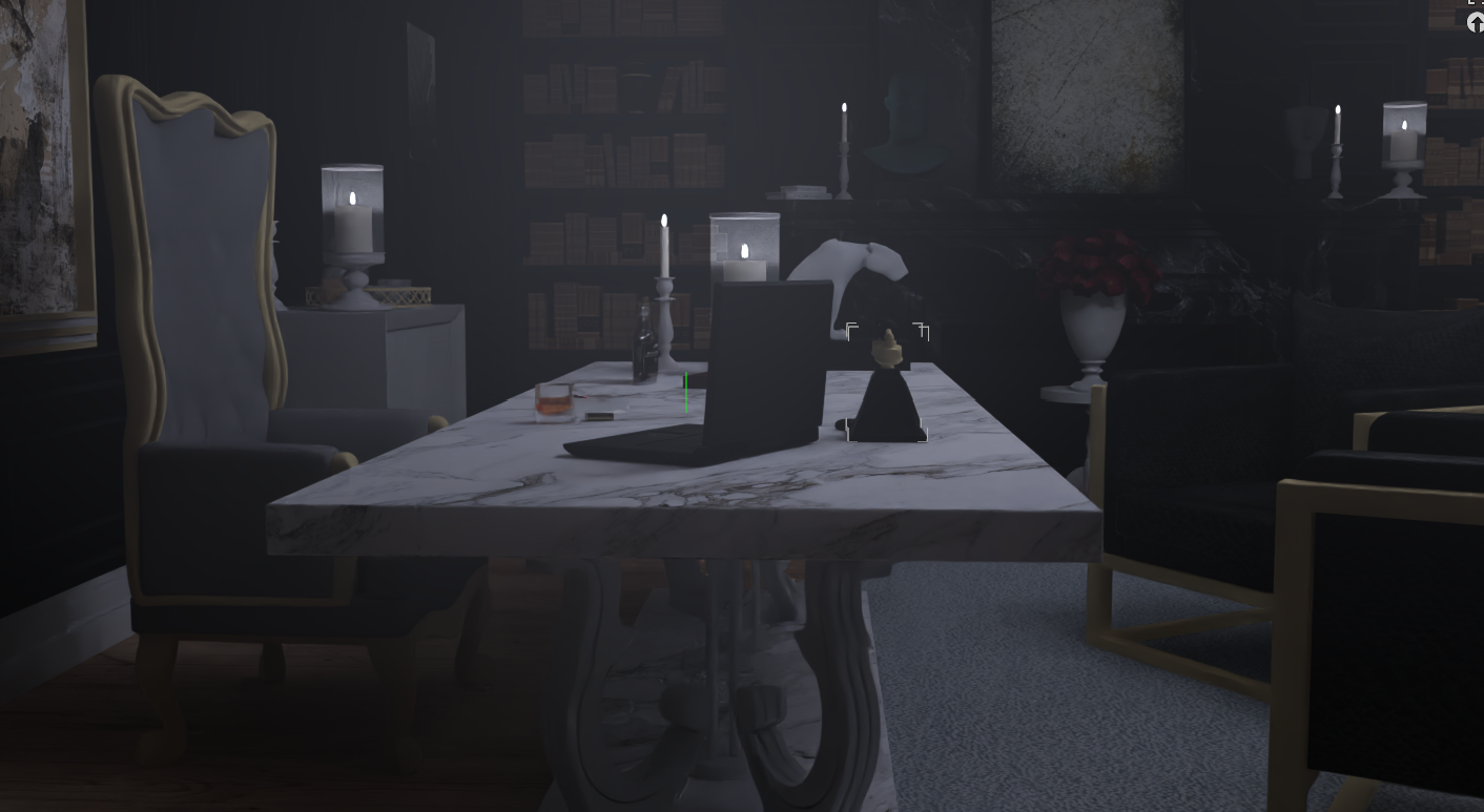
The table leg is not my mistake nor an artistic mistake in general. And I really need to laugh reading a comment of a well known troll postulating it's because of the "Daz denoiser"! How the heck a denoiser should give such an effect??? Yes, the Daz denoiser is horrible but it doesn't matter how horrible it is, it can't cause such an effect just on the table leg part of the image! I never use the denoiser because it flattens the textures. And even in case the denoiser would have caused this leg thing, the entire image would be blurry which is not the case!
That the leg looks like this is because the creator of that asset decided to give it a more "glassy look" by reducing the opacity. I didn't even notice anything wrong with it and also left it like this "glassy". My main focus was also more on stuff above it.
I re-rendered this scene and here you can see the difference with opacity low and full:
Low opacity table leg:
View attachment 1657425
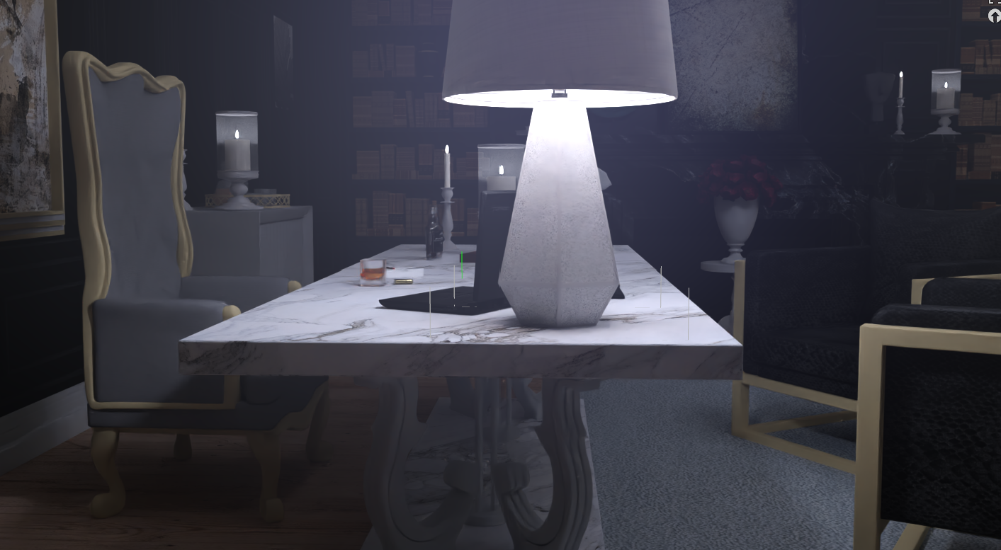
Full opacity table leg:
View attachment 1657426
OK, maybe this looks really better. I also edited some minor stuff, so thanks for the hint with it anyway.
Furthermore, for those who complain about my art is getting worse, probably just because they either have nothing else to do in their life or just out of fun keep digging out ridiculous details to keep bullshitting on my game.
Here's the difference between the standard Daz Studio render, which is already edited a lot in the program, taking the most out of it:
View attachment 1657433
And here's the edited and enhanced version, giving it a more cinematic look, which also takes a lot of steps in PS:
View attachment 1657435
And here's the final upscaled and corrected version:
View attachment 1657454
The sharpness in direct comparison:
View attachment 1657479
And here the direct comparison between the Daz standard render, which is already practically the best you can do with the program, and the final result which will be used in the game:
View attachment 1657543
See, how many steps are necessary to make it look like the final result? So, if this art quality isn't good enough, I'd like to see something better! Especially from the "fan art" which some people praise here so much being better! And this is not even the most demanding render of the update, btw!