Fan Art Something Unlimited - Sprite Re-Mix and Fanart Thread

5.00 star(s) 2 Votes

OhWee

Forum Fanatic
Modder
Game Developer
Jun 17, 2017
5,850
29,759
Circe's new playtoy...

BlackCanaryCirceBalcony.jpg

So, still making progress on the backbone for SU Rebuilt. I'm setting it up so that I can use it for other things too, so it won't be a 'SU Rebuilt' only thing at this point. I do have my own brothel management project along these lines on the backburner at the moment. See my development thread for a more detailed discussion about this, but for now just know that I'm not abandoning the SU Rebuilt Ren'Py thingie...

What WOULD be helpful is more people to help build the various girlpacks. I'm focusing on the framework, but y'all know how the scenes look in SU Unity, so if you are so inclined to start assembling scenes and gals for said scenes, it'd be nice to be able to split the workload up, i.e. pick a girl to focus on and start bulding assets for her girlpack folder. So if you are interested, well until we get a dedicated thread for this just PM me or something and I'll give you a list of what's needed specifically for the profile screens, pull others into the conversation, and our group can discuss what will be needed for the other scenes, and what dimensions that the various assets should be.

The scenes will need to be coded in Ren'Py eventually, but that's something that xMendoza or whomever can help with when the time comes. The more time consuming thing is re-confuring and sizing the assets for the various scenes (dancing, stripping, bordello, etc.).

I'm just cheerleading mainly at the moment when I'm not coding, but I WILL need to get back to other stuff soon. I DO want to see this effort come to fruition though!

This should be a community effort, so if you want to help out, PM me and we'll pull you into the loop!
 
Last edited:

SoulFoZoid

Member
Game Developer
Aug 26, 2017
280
528
OK, first off, thanks for trying to take a stab at this!

Do you have any interest in trying to recreate the 'look and feel' of the SU dialogue style? It looks to me like you are just using the 'Default' Ren'Py style with some minor tweaks. That's not a bad thing, lots of people do it, but it's an option here.

Secondly, tweaking Ren'Py interfaces is kind of my thing. Others may do it better, but I've done it a few times now - FmF, plus I tweaked the interfaces in Babysitter and Brothel King a bit, and probably a couple of other places. The tweaks I made to A New Beginning by JJsworld were more background related though, as he was rendering most of his pics at a more 'square' size than the default Ren'Py size, so I felt that it needed borders...

Mainly, I'm thinking about the menu design, dialogue box, save screen. Also, side images could be an option maybe, but that wouldn't 'match' SU's style as the SU dialogue boxes don't have side images.

I'm not looking for a long term thing project here, but this is something I could bang out pretty quickly depending on if it interests you. A 'one and done' kind of thing. In fact...

View attachment 2200931

I still need to do some fine tuning on the spacing on the game menu screen, like I did here with the main menu, but this'll give you an idea.

My stab at the load/save screen looks like this:


And I was playing around with the dialogue box art here, but I'm not quite happy with it yet...


I can 'square up' the dialogue box pretty easily, I was just taking a quick stab at a 'hand drawn comic book' style here, to see how it might look. There are a number of other examples on the interwebs I'm sure (looking at some options in Google now...)

This is all pretty much screens.rpy tweaks, so if you are game, I could finish tweaking what I have, and hand off the screens.rpy file and associated artwork to you, since you are doing the heavy lifting by trying to recreate the sprite alignments inside of Ren'Py, which is a time consuming projects and I have enough slightly annoyed fans already that are waiting for FmF part two...

The save screen box style I would probably simplify, I was trying something different here to see if I could...

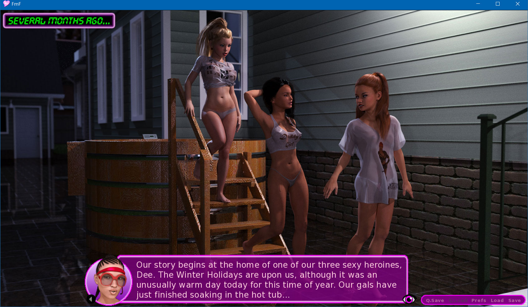
Here are some examples of where I tweaked the dialogue and menus in FmF. I didn't like having the in-game menu choice in the middle of the screen, so I moved it to the bottom...


You'll note that the dialogue box changes in size here based on the amount of text in it. My philosophy in FmF was to clear as much screen space as possible so that people could admire more of the images used ingame. Sure, there's the 'h' key that can hide the dialogue box, but when you are zipping through the story... I also added a button here to hide the dialogue (the eye in the lower right) for those that wanted to do that with a mouse or maybe a touch screen.


Anyways, my point here is that the 'backbone' of Ren'Py is something that I'm rather familiar with, and is something that can drop in seamlessly into whatever you've already done (pretty much just changing out the screens.rpy file and adding new art to the gui folder)

That is if you are interested! This would allow you to keep doing what you are doing, and it's something I could pump out very quickly. I'm guessing you are doing this 'for free' and I'm not looking for monetary compensation, I just want your interface to look pretty...

If you have some of your own ideas, we can discuss this back and forth to get the 'look' that you want when it's all said and done.

So, are you interested?

Edit: If you want to see how the SU text and name box would look in Ren'Py, here's a screenshot.

View attachment 2201136

This is a simple thing of course, attached are the textbox and namebox files should you with to drop those into your /gui folder. The main reason to do this would be to recreate how the textbox looks in SU of course, and in fact it's ALMOST the same art. I simply cropped the namebox into it's own graphic (in the SU sprite folder it's combined).

You may need to adjust the alignment of the namebox of course (and maybe set an xmaximum width on the text box so that it doesn't extend across the bottom of the screen), but you get the idea here!

I'm also using a more 'comic sans' kind of font for the text of course. SU uses a more 'cartooney' font as well, although with just uppercase text.

---

Edit 2: Here's my stab at using the SU 'ingame' font and lining up the namebox in a manner similar to what's seen ingame, while allowing for variable height based on the number of lines of text.


View attachment 2201416
This is exactly why people don't do charity work. My advice is to ignore all the advice and do your own thing. Eventually people will give up and you can advance on your own pace like normal.
 

ShadowWarrior

Well-Known Member
Aug 3, 2017
1,046
1,982
Speaking of GTA styled wallpapers, I made some more ideas off the top of my head, but that's all for a while. ^^; Krull , let me just say thank you for what you've done. My computer has never looked better.

You don't have permission to view the spoiler content. Log in or register now.

You don't have permission to view the spoiler content. Log in or register now.

You don't have permission to view the spoiler content. Log in or register now.
 

OhWee

Forum Fanatic
Modder
Game Developer
Jun 17, 2017
5,850
29,759
Oh wee you will make the android version
I leave the Android ports to the professionals!

Usually some nice Android guy comes along and ports the stuff I've worked on to Android. Not sure if this will play nice with Android, I imagine that it should, but I'm not sure due to how the 'folder search' for girlpacks is invoked. But it'll be a while before the team has the demo build far enough along for such things!
 
5.00 star(s) 2 Votes