Fan Art Something Unlimited - Sprite Re-Mix and Fanart Thread

5.00 star(s) 2 Votes

sensed

Member
Oct 18, 2022
139
967
How are you changing the skin tone on the Catwoman stuff? The middle ones look like Starfire's pose.
 

Jimwalrus

Well-Known Member
Sep 15, 2021
1,045
3,985
OK, I had some issues with my install of Stable Diffusion and, to cut a long story short, testing the fix required me to download a model I'd not downloaded before and check everything worked.

So, as a bit of fun, here are some (female, obvs) - as if captured by Lex Luthor and wearing some very non-regulation uniforms...

"If I had my bolt pistol you would be subject to Field Discipline #1 for this, foul heretic!"
00051-4234425289.png

00043-3715172885.png 00052-4234425290.png 00054-4234425292.png 00055-4234425293.png
 

Jimwalrus

Well-Known Member
Sep 15, 2021
1,045
3,985
We're getting somewhere with the Catwoman set. :whistle:
Here's Dance/Strip/Dance(Nude).

View attachment 2668859 View attachment 2668860 View attachment 2668861

And not to post the same stuff over and over again but this is what I had in mind for those WIP images - with the action taking place on the table/chair. I also made that one anal scene into a Special (Whip/Choking) one.

View attachment 2668876 View attachment 2668881

View attachment 2668877 View attachment 2668882
These are astonishing Lovekraut - thank you so much!

I was busy making some images for this in SD, but ran into technical issues.
So, for the sake of putting these out there, here are some AI-generated images of Catwoman of variable quality, mostly in her DCAU outfit.

Just standing in her catsuit:
00113-2198693429.png 00117-2198693433.png 00123-3673745873.png 00126-3673745876.png 00182-3949069054.png

Kneeling in her catsuit:
00137-2601470490.png 00142-2601470495.png

Unzipping:
00002-2919708945.png 00005-2919708948.png 00007-2919708950.png 00019-2919708962.png 00167-2601470497.png 00198-339147340.png

Nude standing wearing mask and gloves:
00024-1769984034.png 00025-1769984035.png 00027-1769984037.png 00046-1769984056.png 00048-1769984058.png
Kneeling:
00049-93152831.png 00050-93152832.png 00054-93152836.png 00056-93152838.png 00057-93152839.png 00058-93152840.png 00060-93152842.png 00064-93152846.png 00066-93152848.png 00067-93152849.png

Kitty gets the cream:
00083-1372662443.png 00085-1372662445.png 00091-1372662451.png 00093-1372662453.png 00094-1372662454.png 00104-2943839870.png 00105-2943839871.png 00107-2943839873.png 00108-2943839874.png 00112-2943839878.png 00113-2943839879.png 00114-2943839880.png
Arkham Knights cumshot:
00133-57942308.png

Spontaneously generated bodysuit:
00119-3673745869.png
 

Jimwalrus

Well-Known Member
Sep 15, 2021
1,045
3,985
Faora is the female Kryptonian that hangs with General Zod in Superman II (the Christopher Reeve movie) and also in Superman: Man of Steel. She's wearing 'full coverage' body armor in Man of Steel though, so that's not what I'm going for.

Here's a comic panel, also not quite what I'm going for...


Again, I'm not really going for the 'armored' look, more of a 'Sexy fighting uniform' kinda vibe. She can have thigh high socks though, as long as there's bare skin on the thighs/hips, with that classic 'v' bodysuit that SR7 really likes!
View attachment 2421844

Something along these lines as far as the 'cut' of the clothing is kind of what I'm thinking, but with the smaller KF boobs... I don't want this, but about this much of a 'cloth to skin ratio' if that makes any sense.

Feel free to use your imagination!

Or, if someone else wants to take a crack at this, go for it!
Yeah, I finally remembered this!
I found a model of the 'Man of Steel' version of Faora Hu-Ul and made these:

"So, Luthor, you say you are the enemy of Kal-El, yet you imprison me. Fool."
00008-4150971062.png
You don't have permission to view the spoiler content. Log in or register now.
"Why have you dressed me in such a skimpy outfit Luthor? I do not appreciate being gawped at and demeaned in this way!"
00017-1154130627.png
You don't have permission to view the spoiler content. Log in or register now.
"Now this is getting ridiculous Luthor!"
00019-1154130625.png
"Who is this 'Oh-Wee' of whom you speak? Is he some powerful Kryptonian? This outfit would tempt him you say..."
00020-1154130626.png
 

OhWee

Forum Fanatic
Modder
Game Developer
Jun 17, 2017
5,852
29,771
Yeah, I finally remembered this!
I found a model of the 'Man of Steel' version of Faora Hu-Ul and made these:

"So, Luthor, you say you are the enemy of Kal-El, yet you imprison me. Fool."
View attachment 2670518
You don't have permission to view the spoiler content. Log in or register now.
"Why have you dressed me in such a skimpy outfit Luthor? I do not appreciate being gawped at and demeaned in this way!"
View attachment 2670557
You don't have permission to view the spoiler content. Log in or register now.
"Now this is getting ridiculous Luthor!"
View attachment 2670526
"Who is this 'Oh-Wee' of whom you speak? Is he some powerful Kryptonian? This outfit would tempt him you say..."
View attachment 2670567
Nice!
:love: :love: :love: :love: :love: :love: :love::love::love:
Now if we can only get some action poses with that gal...
stripping, sex, etc.
 

Reptile31

Newbie
Oct 16, 2021
22
47
You're right that's from Starfire.
I use Gradient Maps. It allows you to create color palettes for characters and then apply them to other images.
Sometimes just messing around with Hue/Saturation/Brightness can do the job as well.
I can't manage to get the right color with Hue/Saturation. It's really annoying. How do you do it ?
 

OhWee

Forum Fanatic
Modder
Game Developer
Jun 17, 2017
5,852
29,771
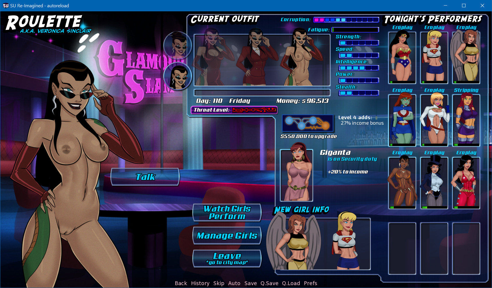
Version 0.27 of that SU ReImagined 'unofficial' Proof of Concept Community demo project thingie has been uploaded!

Details here:
https://f95zone.to/threads/renpy-su...unity-development-thread.144779/post-10917436

This should still very much be considered a playtest build, but there have been a number of changes and additions since 0.26b was made available. Feedback and help with playtesting the new gameplay ideas and such is very much appreciated!

Here's a screenshot, more screenshots have been added to the first page of the demo (linked in the post linked above).


Enjoy!
:cool:
 

Lovekraut

Member
Apr 15, 2022
288
4,925
So much Catwoman o_O
If you don't mind I might pick one or two and fix the eyes.

Faora came out awesome as well. I like all the detail on the armor. Drawing it by hand would be so time consuming.

Warhammer was also an inspired choice. Not usually a universe I associate with female characters. Mira from the first SpaceMarine game is the only one I recall.


I can't manage to get the right color with Hue/Saturation. It's really annoying. How do you do it ?
Yeah it can be frustrating at times. What is the asset you're trying to change and to what character? Also what program are you using?
 

zenzaxaznez

Member
Jun 6, 2018
154
841
I can't manage to get the right color with Hue/Saturation. It's really annoying. How do you do it ?
Here's how I change skin color in Photoshop:

Catwoman Superwoman Tutorial 1.png

This is the starting image, with Catwoman's head sitting all mismatched on top of Superwoman's body.

Catwoman Superwoman Tutorial 2.png

The first adjustment layer I create is a Curves layer. This can be used to change the tone of an image. Curving the line to the upper left makes it lighter, curving it to the lower right makes it darker.

Now I've made her body paler, but her skin color is still wrong.

Catwoman Superwoman Tutorial 3.png

In the Hue/Saturation adjustment layer, I first drag the Hue setting until her body roughly matches her head. Then I drag the Saturation setting until I get the color as close as possible.

Notice that I have the "Colorize" box ticked. This basically makes it so that you get the color that's on the Hue bar, which makes much more sense when trying to find a specific color.

I never touch the Lightness setting, it's never given me good results.

----------------------------------------------------------------------------------------

So the three things I've altered are Curves, Hue and Saturation. I can now go back and fine-tune any of these settings until the body's skin color matches the head as good as possible.
 

OhWee

Forum Fanatic
Modder
Game Developer
Jun 17, 2017
5,852
29,771
Here's how I change skin color in Photoshop:

View attachment 2672863

This is the starting image, with Catwoman's head sitting all mismatched on top of Superwoman's body.

View attachment 2672864

The first adjustment layer I create is a Curves layer. This can be used to change the tone of an image. Curving the line to the upper left makes it lighter, curving it to the lower right makes it darker.

Now I've made her body paler, but her skin color is still wrong.

View attachment 2672865

In the Hue/Saturation adjustment layer, I first drag the Hue setting until her body roughly matches her head. Then I drag the Saturation setting until I get the color as close as possible.

Notice that I have the "Colorize" box ticked. This basically makes it so that you get the color that's on the Hue bar, which makes much more sense when trying to find a specific color.

I never touch the Lightness setting, it's never given me good results.

----------------------------------------------------------------------------------------

So the three things I've altered are Curves, Hue and Saturation. I can now go back and fine-tune any of these settings until the body's skin color matches the head as good as possible.
Note that I'm a huge fan of curves and brightness/contrast when editing my Daz renders, but for this I usually just do hue/saturation/lightness. But of course others probably get the colors a tiny bit closer than I do, I'm just doing this for fun.

But overall your advice is definitely good advice! People really should learn how to mess with Photoshop curves, as they can be a 'rather powerful' tool to use depending on what you are doing. I'm sure that GIMP probably has something similar...
 
  • Like
Reactions: Jimwalrus

OhWee

Forum Fanatic
Modder
Game Developer
Jun 17, 2017
5,852
29,771
Question for the design gurus around here...

So, in ReImagined, I've become preferable to screens with blue-ish backgrounds. It's a bit more complicated, I'm using a pleasing gradient via a Photoshop style I found somewhere and tweaked to taste, but yeah...

Anyways, so this:


So the sky-blueish backgrounds behind the girl picker here helps make the characters pop a little better, which I like, but I'm here to talk about the buttons/slots.

I started to 'color correct' the slots at the left using a hue adjustment, but part of me REALLY likes how the green slots/buttons are contrasting with the new blue screen overlay background. I still plan to replace the four green buttons at the lower right with 'transparent dark blue' buttons that I've started to use in a bunch of places in ReImagined, but back to those green slots...

Need an opinion. Color correct/go blue, or Green slots look awesome? Thoughts?

Edit: I came up with some other cool idea instead...


Still need to tackle the Meta Bordello column, but yeah...
 
Last edited:

TO9x2

Newbie
Jun 8, 2022
67
643
You guys are doing great work.

Lovekraut, your recent Catwoman work was amazing. Love how you included a Bane option. Seeing her get railed by the biggest villain in Gotham is, simply put, super hot.

I don't have much to show for my absence. Here's a little Starfire experiment. First, the costume.

Starfire-Green.jpg

And now it in action.
Starfire-Green-3.jpg Starfire-STX-Behind Green 2.jpg

For the profile I do feel like I'm getting better at shading and I remembered to add the texture layer but my original shapes aren't great and my black outlines aren't the best.

As for the action pic, I need to do two variants. One with the tube top UP and a redo of this one so the tube top appears to "bunch up" right under her breast. Right now it looks like it wasn't even built to be able to go up that hight.

And as for the heels I wasn't sure what color so I went with "all-purpose black.

And before I go, one more quick and easy edit of the Wonder Whores.

Woner Sisters Green 1.jpg

I am still so grateful Donna made it despite not being in the DCAU :love:
 

Reptile31

Newbie
Oct 16, 2021
22
47
So much Catwoman o_O
If you don't mind I might pick one or two and fix the eyes.

Faora came out awesome as well. I like all the detail on the armor. Drawing it by hand would be so time consuming.

Warhammer was also an inspired choice. Not usually a universe I associate with female characters. Mira from the first SpaceMarine game is the only one I recall.


Yeah it can be frustrating at times. What is the asset you're trying to change and to what character? Also what program are you using?
Superwoman leash to wonder woman tone, Adobe
 

Emperor

Member
Aug 2, 2018
201
434
Question for the design gurus around here...

So, in ReImagined, I've become preferable to screens with blue-ish backgrounds. It's a bit more complicated, I'm using a pleasing gradient via a Photoshop style I found somewhere and tweaked to taste, but yeah...

Anyways, so this:


So the sky-blueish backgrounds behind the girl picker here helps make the characters pop a little better, which I like, but I'm here to talk about the buttons/slots.

I started to 'color correct' the slots at the left using a hue adjustment, but part of me REALLY likes how the green slots/buttons are contrasting with the new blue screen overlay background. I still plan to replace the four green buttons at the lower right with 'transparent dark blue' buttons that I've started to use in a bunch of places in ReImagined, but back to those green slots...

Need an opinion. Color correct/go blue, or Green slots look awesome? Thoughts?
I'd go for blue. it more calming and it looks better IMO.
 
5.00 star(s) 2 Votes